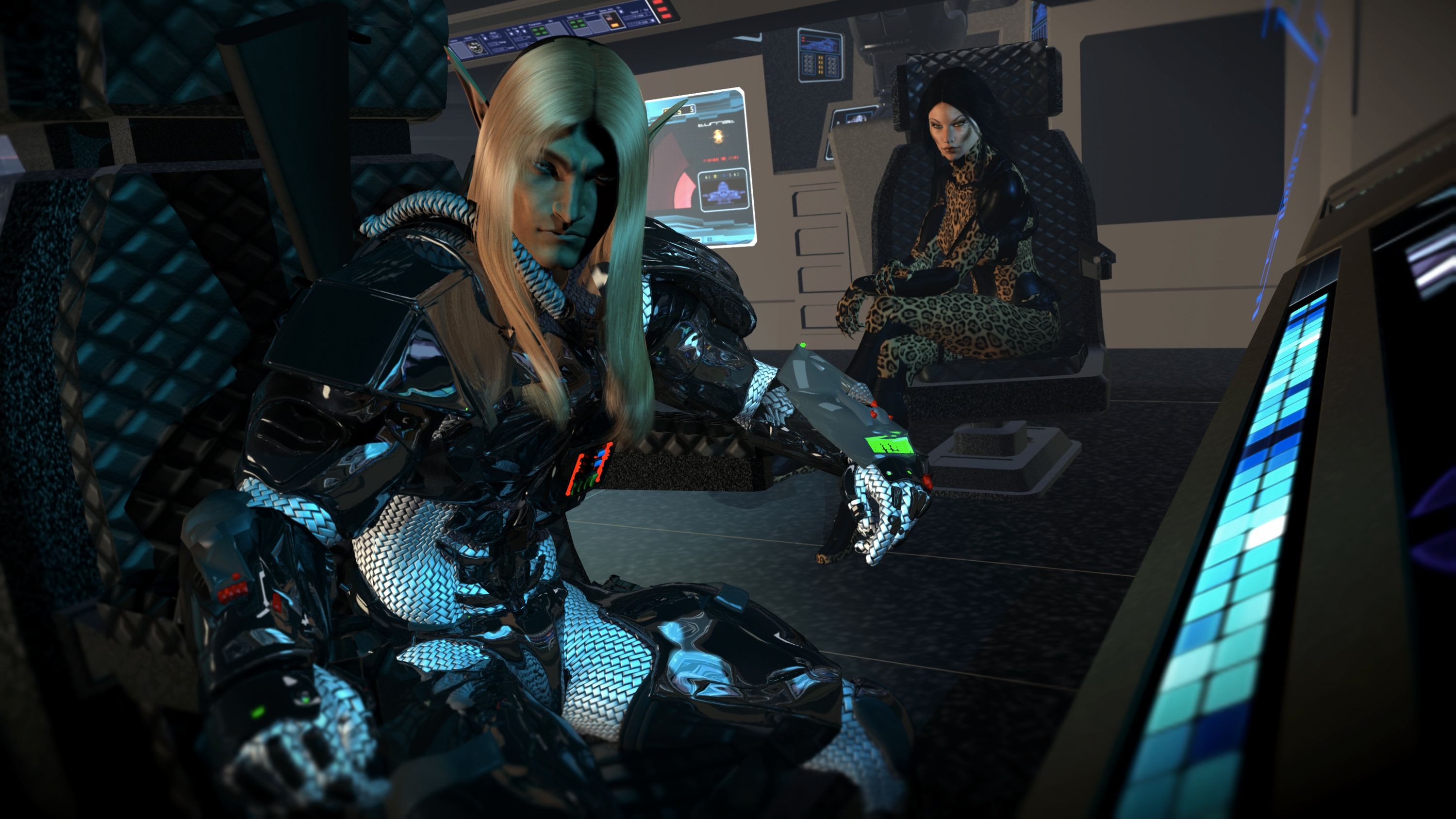
Yeah, you capture that discomfort of a breakup reunion quite well in this segment.
Okay, you asked for it...

As far as the image re-do, I think both are quite good but there are things I don't like in both as well. I find the overdone bump mapping in Obsidian's face the most distracting part of the original. In the redo, there are definite improvements in the lighting and composition however while Obsidian's hair has a more natural texture, it feels tacked on afterwards (maybe that odd black shadow at the top?) and the his shadow on his chair is too sharp for the lighting and needs to softened. Also, since the main focus is on the two characters, they feel a little left of center without the holographic screen to add additional compositional weight. Looks like the camera could shift slightly left or better still, shift right slightly and pan left. Lastly, it seems like there may be some funky things going on with the focus. It is particularly evident on Obsidian's left leg where it shifts from a pretty sharp focus above the knee to pretty blurry below.
BTW, check yr PMs. I sent ya a question.


 ! 3D Art !
 Original Characters