Bwahahaha, my evil influence grows ever stronger!

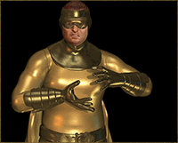
Nice work. I like that you took the time to add edges and wrinkles, and that the clothing and belt have a different texture from the skin. It's good work. As His Pijness says, you improve steadily!
Critique follows, in-depth and nitpicky even by my standards. Feel free to ignore anything where y'think I'm just going on too much.

First, Pij is right about the hair, though the fact that the model seems to have two-tone hair doesn't exactly help. The dark edges can be fairly easily improved just by running the dodge tool (set to shadows) over them. I'd also suggest drawing in some individual hairs with a semi-transparent 1-pixel brush, to make the edges less solid. Hair doesn't have strict, clean edges; just look at any photo portrait, and you'll see lots of little unruly flyaway hairs around the edges.
Also with the hair: it's a bit flat in terms of colour and would benefit from more contrast between the shadows and the highlights. Playing around with Brightness/Contrast, Levels and/or Curves can help, though your best bet is probably to go in manually to darken the darker areas and brighten the lighter ones. The costume would also benefit from that, to a lesser degree. It's alright as is, but, well, just compare your version of the costume with far more interesting and varied reds in the reference image! I'd also consider adding some more shading to the eyes and the skull thingy, for similar reasons. The skin's fine, but I think the the method you use to change colour doesn't work quite as well for hair or clothing (at least in this instance). And if you really want to go that extra step, you could also add some subtle variation in hue.
... and I should just write a colour changing tutorial, cause while there's tons more I could say, I realize most people are perfectly content with doing things in a simpler way than I am.

What else? I think you could do seams, if you want to. Some people don't like 'em, I do. But they're done the same basic way as edges, so if you can do one you can do the other. You might also want to work on making your edges a bit cleaner; they look a bit rough and angular in spots (notably the shoulder strap). Play around with the pen tool to get nice, smooth curves. The wrinkles are well-placed and not overdone, which is good. They could perhaps be blended in a bit better but, well, wrinkles can ALWAYS use more work. I sometimes still have trouble with the damn things...


 ! Manip !
 Marvel Comics


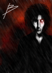

 I do think the hair is what could most have used more work. The thick dark contrast of it's outline stands out too much because it's the only place it's used. There's also a place on her forehead where that dark line separating skin from hair has blue hair poking thru on the skin side. Still, good stuff.