Main Menu
Search

Advanced Search
or try google search
HM's Goodies and such
Become a Gold member!

Click Here for more Details about gold Memberships or click the Icon above to donate. Remember to include your Username with donations.
Random Images
Super Booty
Animal Corps 9
ShinkenRed - Shiba Takeru
Traata Capitol of Kryllia Prime
Top Posters
1
Dragondack
11251
2
JrMcDeath
6982
3
Winterhawk
6812
4
pijon
6363
5
Dark Wanderer
5149
6
StarChild
3909
7
OCP
3461
8
Thayne
3290
9
BikerBot
3277
10
bhm1954
2852
Who's Online
66 user(s) are online (30 user(s) are browsing Heromorph Gallery)

Members: 0
Guests: 66

more...
advertisements
Your
AD
Here!
» Sign up Today!!
» Newest Forum Posts
» advertisements
Your AD Here!

Main : ! 2D Art ! : DC Comics :  Superman

[<   Previous  550  551  552  553  554  555  556  Next   >]

Superman
SupermanPopular
Submittercypher389More Photos from cypher389   Last Update2008/3/31 8:25
Hits2349  Comments4    
Drawn by my brother...Colored by me.

My brother asked me to color a couple of his sketches, it turned out half-decent, so I figured I'd post it.  Had to remove a lot of the paper marks, and discoloration from the scan of the drawing, but all in all...not too bad.

[<   Previous  550  551  552  553  554  555  556  Next   >]

The comments are owned by the poster. We aren't responsible for their content.
Poster Thread
Darkwinter999
Posted: 2008/4/6 15:33  Updated: 2008/4/6 15:33
superhero
Joined: 2007/3/10
From: the Shadow World
Posts: 492
 Re: Superman
It looks good for what it is. That's a compliment because I am a harsh critic and a major fan of realism, which this so obviously is not. ;)
I never gave the white spots a second thought, personally I think the brushed look makes the line-art and color blend together, otherwise, it starts looking like you are mixing your mediums. Good call.
Dragondack
Posted: 2008/4/1 20:42  Updated: 2008/4/1 20:42
The Great Eternal Dragon
Joined: 2004/2/9
From: Edmonton,Alberta,Canada
Posts: 11251
 Re: Superman
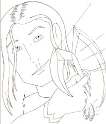
It has a very carved look to the colouring and drawing but still not to bad though!
cypher389
Posted: 2008/3/31 10:55  Updated: 2008/3/31 10:55
superhero
Joined: 2006/6/7
From: Nova Scotia, Canada
Posts: 257
 Re: Superman
I should have put that in the description. That is the style I was going for. Tried to give that brush painted look, with the highlight strokes on the cape, and other areas. I like the way it felt, so I left it.
I also gave the "S" shield, a raised look so it didn't look so flat.
bhm1954
Posted: 2008/3/31 9:25  Updated: 2008/3/31 9:25
Hero to the stars
Joined: 2005/7/18
From: Moses Lake, Washington
Posts: 2852
 Re: Superman
I agree with you, it is "half decent" but did you look at the edges? It looks like you forgot to do close in detail and finish work on this.

If this is the style and look you were going for than great, but if not, in my opinion it could use more work.


»
»