/bow
Many thanks, they're as perfect as I can manage tracing from a 600 dpi scan of some old issues, and if I could figure out how to make the black outlines as strokes and not filled shapes I'd redo the second logo at some point. But I'm still kinda an Illustrator noob.
As they're not the black lines may not be entirely uniform in thickness throughout, but I've made them as close as I can, and you have to zoom in pretty much all the way to detect it. (Think blowing the logo up poster or wall size.)
In the meantime here's a preview of the chest insignia that will end up in my Kara package to whet your appetite. and yes it's an EPS like the logos.

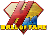
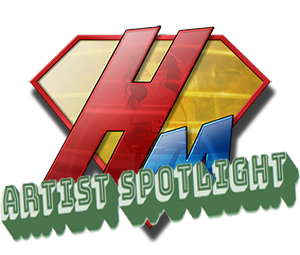


 Logo.zip


