Main Menu
Search

Advanced Search
or try google search
HM's Goodies and such
Become a Gold member!

Click Here for more Details about gold Memberships or click the Icon above to donate. Remember to include your Username with donations.
Random Images
The H.E.R.O.M.O.R.P.H. Team 12
The Ultimate Lantern Corps
Matt & Milla
MORRIGAN ON THE PROWL
Top Posters
1
Dragondack
11277
2
JrMcDeath
6993
3
Winterhawk
6812
4
pijon
6363
5
Dark Wanderer
5149
6
StarChild
3909
7
OCP
3461
8
Thayne
3290
9
BikerBot
3277
10
bhm1954
2852
Who's Online
122 user(s) are online (75 user(s) are browsing Heromorph Gallery)

Members: 0
Guests: 122

more...
advertisements
Your
AD
Here!
» Sign up Today!!
» Newest Forum Posts
» advertisements
Your AD Here!

Main : ! 3D Art ! : Marvel Comics :  iron man 4 decisions

[<   Previous  1053  1054  1055  1056  1057  1058  1059  Next   >]

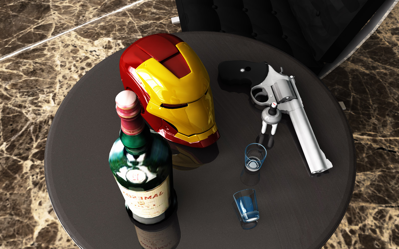
iron man 4 decisions
iron man 4 decisionsPopular
SubmitterahderMore Photos from ahder   Last Update2010/8/19 4:55
Hits2147  Comments3    

[<   Previous  1053  1054  1055  1056  1057  1058  1059  Next   >]

The comments are owned by the poster. We aren't responsible for their content.
Poster Thread
Guest
Posted: 2010/8/22 14:50  Updated: 2010/8/22 14:56
 Re: iron man 4 decisions
It's the models for the shot glasses get rid of the blue and go with a very light turquoise, the gun needs to be chromed or Dark Gray (dark gray is easiest to pull off) but the followin suggestions will help you get that chrome look. The next thing is the Helmet get rid of the white gloss it makes it look like plastic or enamel paint.

For colors reflect with a lighter color than you are using, for white reflect with a darker color. I have no clue why this formula works but I will post an Iron man Armor just to show what I'm talking about look for it today.

Okay I had this one happen when i did my pic of steel ( http://heromorph.com/heromorph2/modules/myalbum4/photo.php?lid=15876 ) it first looked like tarnished silver, to get this chrome look I took some advice from a friend & used a medium gray for the gloss. As for the Iron-Man helmet try a light tan instead of yellow with a light yellow gloss & use a red gloss for the res parts. The gun handle should be matt as should the lead on the bullets. Everything else in your pic is absolutely perfect don't change a thing. make sure you set the crome parts to reflect 50%- 100%.

This net piece of advice I only use in Daz & I don't know if it works in Vue: In the gloss are 2 settings upper & lower they have no name just a dial I leave the bottom at 100%. The top one if LOWERED makes the surface seem to glow and shine, obviously if it is too low you won't get the desired effect so fore chrome I set it at about 85%-65% and that usually does the trick. try using that for nickle plating or any color of chrome.

Good luck & happy rendering

ahder
Posted: 2010/8/20 3:40  Updated: 2010/8/20 3:40
vigilante
Joined: 2010/7/17
From:
Posts: 17
 Re: iron man 4 decisions
thanks, as for the bottle your so right, i didn t notice that.

i m having a little of a problem cause i can t find the problem for the lack of perfect realism, i want to achieve more perfection on the scenes and i don t know what is wrong, is it the lighting? or the materials? the models?
Guest
Posted: 2010/8/19 20:51  Updated: 2010/8/19 20:55
 Re: iron man 4 decisions
looks like only 3 decisions: Drink, Be iron Man, or suicide. if there's a fourth i can't see it & um The "Jameson" bottle label is backwards. That aside, sweet render dude excellent composition & lighting I love the whole concept very provocative.


»
»