| Poster
| Thread
|
| Dragondack |
Posted: 2018/3/10 23:33 Updated: 2018/3/10 23:33 |
The Great Eternal Dragon   Joined: 2004/2/9 From: Edmonton,Alberta,Canada Posts: 11325 |
 Re: One Great Image From Three Seperate Renders...  I like it! |
|
|
| B |
Posted: 2013/2/23 19:36 Updated: 2013/2/23 19:36 |
The New Number 2 (Moderator-Like Guy)   Joined: 2004/5/16 From: Kamloops, BC, Canada Posts: 1366 |
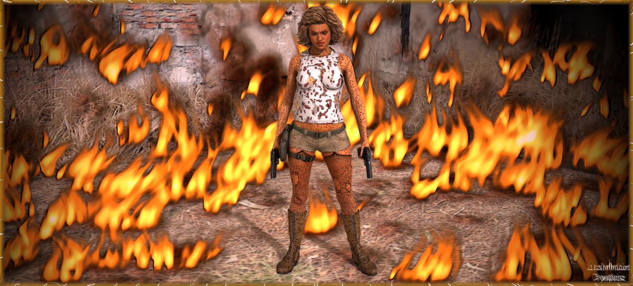
 Re: One Great Image From Three Seperate Renders... The problem with the flames is that they are too blurred, too big, and not interacting with the environment (ie, casting light and shadows). I also agree that if those are blood spatters then don't really work -- too small and even. The image overall is nicelt widescreen and badass (though I can see why Star finds it incomplete), and the character looks very good.
|
|
|
| pijon |
Posted: 2013/2/22 18:25 Updated: 2013/2/22 18:25 |
Moderator   Joined: 2006/7/18 From: United States Posts: 6363 |
 Re: One Great Image From Three Seperate Renders... Admittedly, I'd thought her a leopard girl at first glance but hella cool! Great dramatic thing going here.
|
|
|
| StarChild |
Posted: 2013/2/19 18:39 Updated: 2013/2/19 18:39 |
Shaper of Worlds   Joined: 2004/4/5 From: Matteson, Il Posts: 3909 |
 Re: One Great Image From Three Seperate Renders... okay. now let me get this straight. that's blood splatter all over her right? and not a bad case of the measels. not bad but should be runny in some spots. it seems like this image is trying to say something but kind of looks incomplete. who's she facing or just blasted? she herself looks great..love the outfit. fire effects leave a lot to be desired..they're nicely done but just dont look real enough for this image.
|
|
|




 ! 3D Art !
 Original Characters


 I like it!
