I hate to pile on here but...
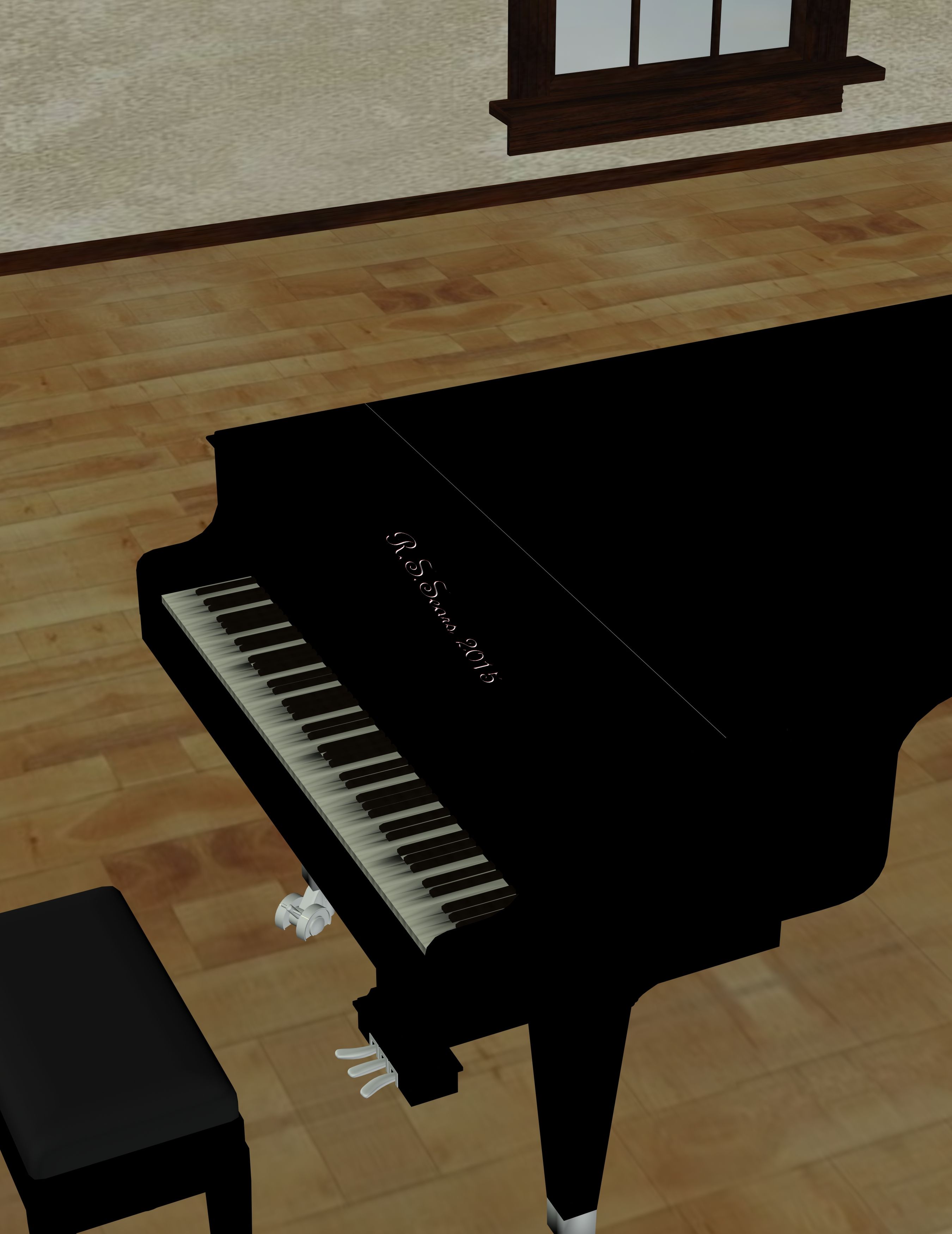
Let me start with the good part. I like the composition here. The piano, chair, window and floor moulding break up space in an interesting way and one that's a little different from what we see here usually.
I also understand how frustrating a sluggish PC can be. It's enough to give anyone a headache.
Still, to DW and Star's points, you're not giving us much here. A piano in an empty room doesn't really qualify for any theme within the site and it's flawed. Missing textures and misplaced on the floor are easy fixes. There's also an inconsistent shading on most of the G keys. The window is also unnaturally low on the wall. The simplicity of elements in the image draws the eyes more to the mistakes. I hope you don't stop here though. I'd like to see you do more with this piano. I think a sexily posed Aiko laying on top of it while Hiro is playing it would be very cool indeed or even just a sexy Aiko playing it. I think it would also be an interesting opportunity for you to do a landscape ratio picture since I'd only noticed one (completed Inspiration Map; thank you) in your gallery.
Take it as a compliment that folks (particularly talented ones like DW and Star) take the time to critique your work

You've definitely shown improvement over time. Keep going!


 ! 3D Art !
 Other Comics


 You've definitely shown improvement over time. Keep going!


