| Poster
| Thread
|
| Hisstoryman |
Posted: 2008/12/6 4:31 Updated: 2008/12/6 4:31 |
Gold Member   Joined: 2007/10/5 From: Brooklyn, NY Posts: 1231 |
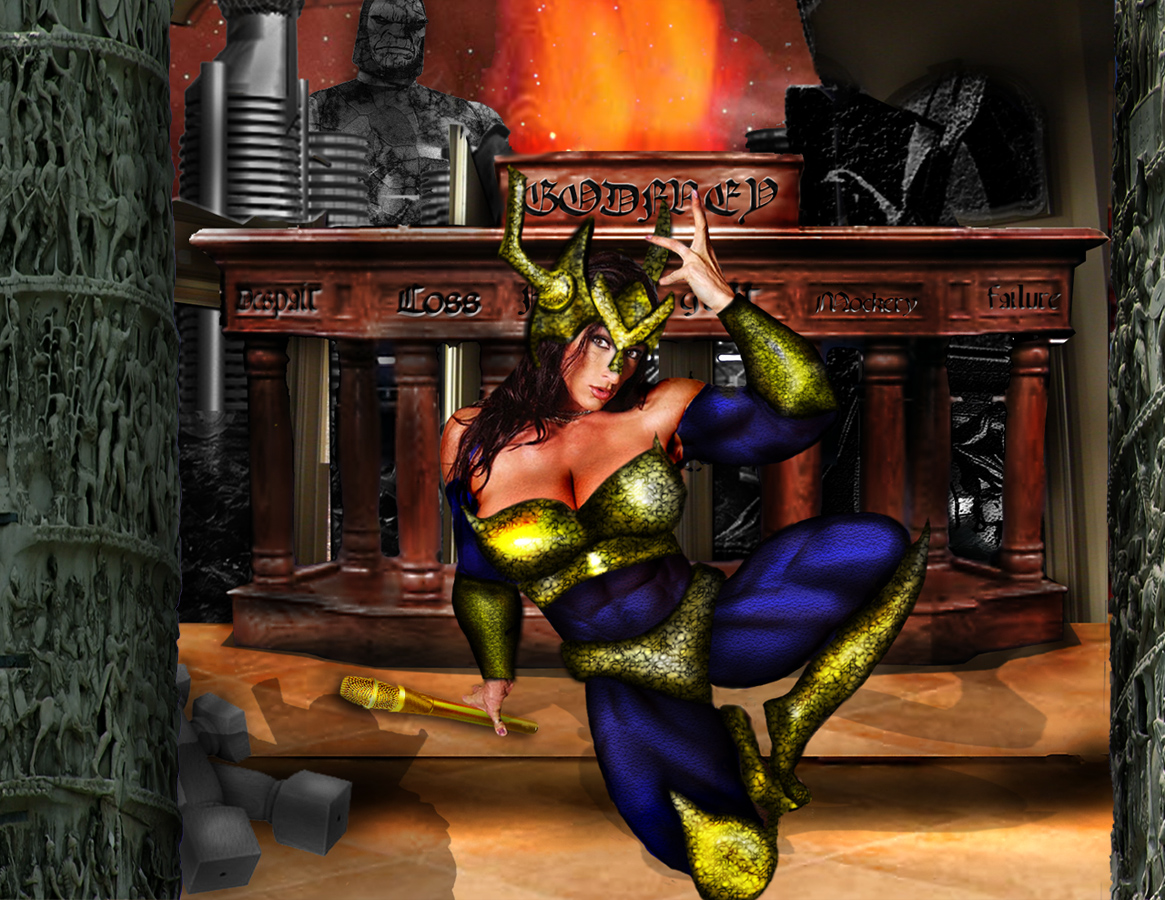
 Re: BIG BARDA: FIRST ENCOUNTER Thank you all for your encouragement and critiques. They are always appreciated. And JrMcD I see what you mean about the flatness of the armor.
|
|
|
| pijon |
Posted: 2008/12/6 1:53 Updated: 2008/12/6 1:53 |
Moderator   Joined: 2006/7/18 From: United States Posts: 6363 |
 Re: BIG BARDA: FIRST ENCOUNTER I can see you really put a whole lot of work into this one Hisstoryman and your stuff continues to improve with each piece. Keep up the good work!
|
|
|
| JrMcDeath |
Posted: 2008/12/4 10:05 Updated: 2008/12/4 10:05 |
Kling on HM (WebMaster!)   Joined: 2004/7/19 From: My Box Posts: 6995 |
 Re: BIG BARDA: FIRST ENCOUNTER I like...but her armor is a flat. If the future i would try and get more contrast between the edges and the rounded centers of the armor. Make sense?
But yeah, the whole scene is pretty good.
|
|
|
| Hisstoryman |
Posted: 2008/12/2 18:31 Updated: 2008/12/2 18:31 |
Gold Member   Joined: 2007/10/5 From: Brooklyn, NY Posts: 1231 |
 Re: BIG BARDA: FIRST ENCOUNTER I could move her up a bit....
|
|
|
| Android |
Posted: 2008/12/2 18:25 Updated: 2008/12/2 19:42 |
Magnifcent Mechanical Marvel (HFC)   Joined: 2004/6/25 From: Curitiba, Parana, Brazil Posts: 667 |
 Re: BIG BARDA: FIRST ENCOUNTER Mr. HM?
Ahm... this is something that people simply ignore and my deepest hope is that you are not going to be one of them: do not cut her knee off again. This is ugly. I know that several pics on the internet do that but, hey, they were made by stressed professionals with no time to do a better job. In the future, try to frame your model by specific areas like the waist or thorax or let the model intact!
But there are good things to say, of course!
You built a complex scenario, created a plot, made her costume! It's easy to perceive dedication here. I congratulate you for those efforts, sir.
Well done!
Edited notes: Congratulations! Much, much better, Mr. HM!
|
|
|
| Hisstoryman |
Posted: 2008/12/1 18:08 Updated: 2008/12/1 18:08 |
Gold Member   Joined: 2007/10/5 From: Brooklyn, NY Posts: 1231 |
 Re: BIG BARDA: FIRST ENCOUNTER I thought about dong that OCP, but I went with handwriting because I wanted to look like hand sprayed graffiti. In the current Final Crisis mini series, most of the "Annoucements" from Darkseid are crudely spray painted. So that is the look I went with.
|
|
|
| OCP |
Posted: 2008/12/1 8:46 Updated: 2008/12/1 8:46 |
Wizard of Lasagna (Mod)   Joined: 2007/5/20 From: From the Other Side of the Ocean Posts: 3461 |
 Re: BIG BARDA: FIRST ENCOUNTER Looks very good, Hiss.   I only have a lttle nitpick: try using the text tool instead of writing yourself, there are really great fonts out there that make it look really cool, you can even play a bit with the blending mode for that look you want.  |
|
|



 ! Manip !
 DC Comics