| Poster
| Thread
|
| Kallisti |
Posted: 2004/10/18 15:15 Updated: 2004/10/18 15:15 |
superhero   Joined: 2004/3/2 From: Posts: 438 |
 Re: Adventure in Outerspace this is one of the coolest action shots i've ever seen!
|
|
|
| Dark_Knight_DK |
Posted: 2004/8/20 10:41 Updated: 2004/8/20 10:41 |
Bat Junkie...and who took my meds???   Joined: 2003/8/18 From: Mexico City (we don't wear hats) Posts: 2623 |
 Re: Adventure in Outerspace Great pic jover, I wish to do an action pic like yours
|
|
|
| Jover |
Posted: 2004/8/17 14:38 Updated: 2004/8/17 14:38 |
mutant   Joined: 2003/8/18 From: Posts: 116 |
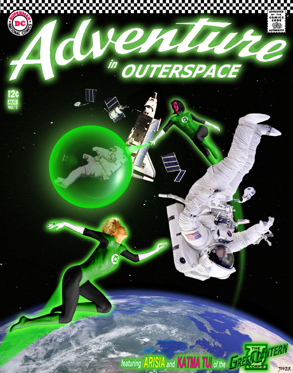
 Re: Adventure in Outerspace Wow! Lots of compliments and comments on this one. I'm glad y'all liked it and a big thank you to everyone who took the time to say so. Nice to see there still fans of these characters out there too!
Now lets see about some individual replies.
Bikerbot - you're right about the title lettering, I got a little lazy on that part and used a cover scan. The glow-y parts are my subtle swipe at all the "enhanced" covers that are used these days. This cover would glow in the dark!
BarnabusBlackoak - the only name given for the model is Hanna, although the hair I used for Arisia is more well known, it came from Renee O'Connor who played Gabreille on Xena Warrior Princess.
soccerkd11 - Thanks for defending my pic, the reasons you stated match my own. Although I don't think android's comments were a critism of my work, but those of a fellow artist offering his thoughts on what could be improved.
android - having green highlights on the GL's costumes and skin would be more photo realistic and I actually experimented with this a little bit during the manipping process. While I managed to get some nice effects on the dark parts of their costumes, the white gloves didn't look right and more importantly (to me anyway) it changed Katma's red/purple skin tone into a dull brown, so I abandoned the idea and went with the traditional GL look, which I think works nicely. I do however appreciate your suggestions and that you liked my work very much.
Jover
|
|
|
| Flux |
Posted: 2004/8/16 17:05 Updated: 2004/8/16 17:05 |
sidekick   Joined: 2004/1/5 From: Leeds, England Posts: 82 |
 Re: Adventure in Outerspace |
|
|
| BikerBot |
Posted: 2004/8/16 16:52 Updated: 2004/8/16 16:52 |
Mr. The Mighty Lord *Krackaboom!*   Joined: 2004/1/13 From: The Good Earth Posts: 3277 |
 Re: Adventure in Outerspace I think this is really good, it's very glow-y. It tells the story of the story, so to speak, very well (shuttle had explosion while astronauts were outside, GL Corps to the rescue!). If I was going to quibble about anything, you could have spent more time on the lettering, especially the title lettering. I only say that because Photoshop is so good/easy at manipulating text.   BB  |
|
|
| SilverAgeMage |
Posted: 2004/8/16 16:23 Updated: 2004/8/16 16:23 |
superhero   Joined: 2004/5/17 From: Pittsburgh area Posts: 452 |
 Re: Adventure in Outerspace Lots of stuff to compliment here, so I'll stick to giving you a silver-age thumbs up for using the old DC logo, the Code stamp and the "go-go" checks! Nice job!   |
|
|
| BarnabusBlackoak |
Posted: 2004/8/16 8:22 Updated: 2004/8/16 8:22 |
sidekick   Joined: 2003/10/19 From: Posts: 83 |
 Re: Adventure in Outerspace Who was the base model for Arisia ?
|
|
|
| Winterhawk |
Posted: 2004/8/15 23:48 Updated: 2004/8/15 23:48 |
Guardian of the Great White North (Webmaster)   Joined: 2003/8/17 From: Canada Posts: 6812 |
 Re: Adventure in Outerspace This is good stuff Jover. I really like the costumes on the ladies. I also really like these 2 characters. good choice for a manip. also Very nice cover re-creation.  |
|
|
| Dragondack |
Posted: 2004/8/15 22:43 Updated: 2004/8/15 22:43 |
The Great Eternal Dragon   Joined: 2004/2/9 From: Edmonton,Alberta,Canada Posts: 11325 |
 Re: Adventure in Outerspace  Two of my favorite GL's! Two of my favorite GL's! The little Blonde Babe & the Red skin Babe? Nice cover rendering and it's an old 12cent  |
|
|
| soccerkd11 |
Posted: 2004/8/15 21:24 Updated: 2004/8/15 21:24 |
sidekick   Joined: 2004/2/1 From: you mean that we have to actually BE somewhere? Posts: 56 |
 Re: Adventure in Outerspace I feel that I should step in and defend the artwork here. The artist followed vintage and even modern style Green Lantern art in haveign them sillowetted in Green, that allows the characters skin color and costume design to show through to the reader.
|
|
|
| Android |
Posted: 2004/8/15 12:12 Updated: 2004/8/15 12:12 |
Magnifcent Mechanical Marvel (HFC)   Joined: 2004/6/25 From: Curitiba, Parana, Brazil Posts: 667 |
 Re: Adventure in Outerspace Do you know what would be interesting?
Since both women are protected by their rings, I think their skin colors could have more green. How about some green lights on the space clothes?
Also, you could rearrange their facial expressions to show us the urgency on the scene.
But, above all, I am only saying those things because I like your work very much. Well done. Good image researches.
"Blame my English teacher"
|
|
|





 ! Manip !
 DC Comics