| Poster
| Thread
|
| JrMcDeath |
Posted: 2007/6/20 11:46 Updated: 2007/6/20 11:46 |
Kling on HM (WebMaster!)   Joined: 2004/7/19 From: My Box Posts: 6995 |
 Re: supergirl 2 Mmmmm.... Giesel
|
|
|
| JRC4th |
Posted: 2005/11/23 21:48 Updated: 2005/11/23 21:48 |
Supreme being   Joined: 2004/12/12 From: Kentucky Posts: 1000 |
 Re: supergirl 2 good one.the long dangly earrings kindda bother me,though  |
|
|
| Thayne |
Posted: 2005/5/26 11:22 Updated: 2005/5/26 11:22 |
Dazed and Confused... mostly Confused   Joined: 2004/7/15 From: usa Posts: 3290 |
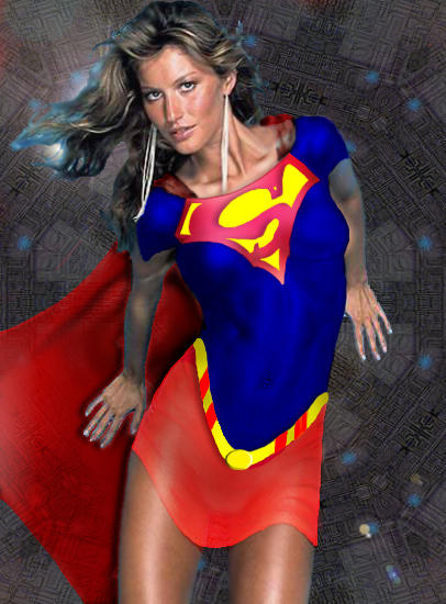
 Re: supergirl 2 Nice model, keep working on the skirt. Something looks stretched about the whole pic.
|
|
|
| VampireLover |
Posted: 2005/5/1 17:40 Updated: 2005/5/1 17:40 |
Seductress of Sin (real life Babe)   Joined: 2005/2/20 From: Hottest Depths of Hell Posts: 2223 |
 Re: supergirl 2 I don't pay attention to Supergirl, is this a real costume? Either way, ilike it.
|
|
|
| StarChild |
Posted: 2005/4/8 17:15 Updated: 2005/4/8 17:15 |
Shaper of Worlds   Joined: 2004/4/5 From: Matteson, Il Posts: 3909 |
 Re: supergirl 2 So why is this picture in the comedy section?  Or am i missing a subtle criticism?  |
|
|
| Nightowl |
Posted: 2005/2/14 19:18 Updated: 2005/2/14 19:18 |
superhero   Joined: 2003/10/25 From: The shadows of night Posts: 422 |
 Re: supergirl 2 Nice picture but it has a wave-like design that seems to curve with her body
|
|
|
| StarChild |
Posted: 2005/2/14 19:03 Updated: 2005/2/14 19:03 |
Shaper of Worlds   Joined: 2004/4/5 From: Matteson, Il Posts: 3909 |
 Re: supergirl 2 Edges are pretty rough and that cape definately looks see-thru. Like the model though. Kinda looks like a young Farrah Fawcett.
|
|
|
| Dragondack |
Posted: 2005/2/14 18:44 Updated: 2005/2/14 18:44 |
The Great Eternal Dragon   Joined: 2004/2/9 From: Edmonton,Alberta,Canada Posts: 11321 |
 Re: supergirl 2  Not a to bad retouch but keep praticing you'll only get better from here?  |
|
|
| SilverAgeMage |
Posted: 2005/2/14 17:23 Updated: 2005/2/14 17:23 |
superhero   Joined: 2004/5/17 From: Pittsburgh area Posts: 452 |
 Re: supergirl 2 CON: The belt looks droopy and the cape does look
transparent. PRO: The model is good, your shading
on her top is very good, and I like the way you conformed the "S" to her shape. The PROs win!
|
|
|
| Wasmith |
Posted: 2005/2/14 8:10 Updated: 2005/2/14 8:10 |
Time Lord!   Joined: 2004/8/27 From: Knobblers Gob Posts: 2002 |
 Re: supergirl 2 Getting better.. The "S" emblem is a bit weird to me, and is the cape supposed to fade to transparency?
I often find myself wanting to go back and "update" older work, but I find it a bit easier to just do a new one from scratch using new techniques I have picked up.
|
|
|



 ! Manip !
 DC Comics