| Poster
| Thread
|
| Winterhawk |
Posted: 2004/2/9 10:09 Updated: 2004/2/9 10:09 |
Guardian of the Great White North (Webmaster)   Joined: 2003/8/17 From: Canada Posts: 6812 |
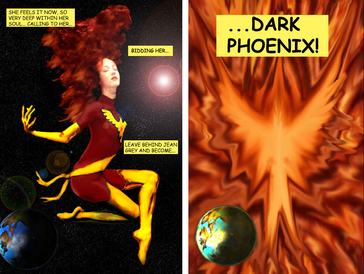
 Re: Dark Phoenix Nice picture. I like the details on the costume. You put it together very well.
The biggest piece of advise i have for you is to take your time. When i was first starting out, I figured "I can do this, no problem" and i started to turn out manip after manip. It was not until i stopped and started to experiment with the tools and took my time, that my manips started to look good. I also would surf the internet looking for tutorials on lots of different things and try them out. not for posting but just to see if i could do it and what types of effects they can make. now i myself, only think my stuff is slightly above average and i am no where near where i want to be. but i take my time and i make it a point to try something new on every single manip. I also have a notebook that i write down what i did, so i can duplicate the effects later on if they worked well.
|
|
|
| Quinn |
Posted: 2004/2/9 6:06 Updated: 2004/2/9 6:06 |
sidekick   Joined: 2004/1/31 From: Posts: 62 |
 Re: Dark Phoenix Thanks for the feedback guys.
I have gone through a few of the tutorials a couple times, and I know I need to do them several more times... until what I'm reading in the tutorial turns on the little lightbulb over my head. Still haven't gotten the hang of some things, and not sure why other bits are done. And some things are just going to require more practice, until I get better at them :oops: (I may post some questions in the photomanip forums on some of that stuff).
One of the lessons I learned in this manip was to keep better track of color... I didn't do that and it shows in the yellow/gold areas. Do you guys tend to work on areas of the same color at the same time (linking them?) or are you just better note-takers than I am?
Truthfully, I'm aware that I'm suffering from the desire to run before I can walk all that well...
Again, thanks for the comments and I'll keep trying to improve.
Q
|
|
|
| Angelophile |
Posted: 2004/2/9 2:02 Updated: 2004/2/9 2:02 |
mutant   Joined: 2003/11/3 From: England, UK Posts: 121 |
 Re: Dark Phoenix I think the real strength here is that you've thought the manip through and actually come up with a setting for the character, rather than just doing a straight manip. The backgrounds, effects and the composition of the pic are the highlights, making whole greater than the sum of it's parts.
|
|
|
| Brick |
Posted: 2004/2/8 22:10 Updated: 2004/2/8 22:10 |
Technophobic   Joined: 2003/10/23 From: Pacific North West Posts: 455 |
 Re: Dark Phoenix I thought that picture would lend itself well to something like this when I posted it. Its not surprising that we ended up doing something similar.
Good perspective on the logo. Have you checked out the tutorials in the downloads section?
|
|
|




 ! Manip !
 Marvel Comics