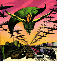
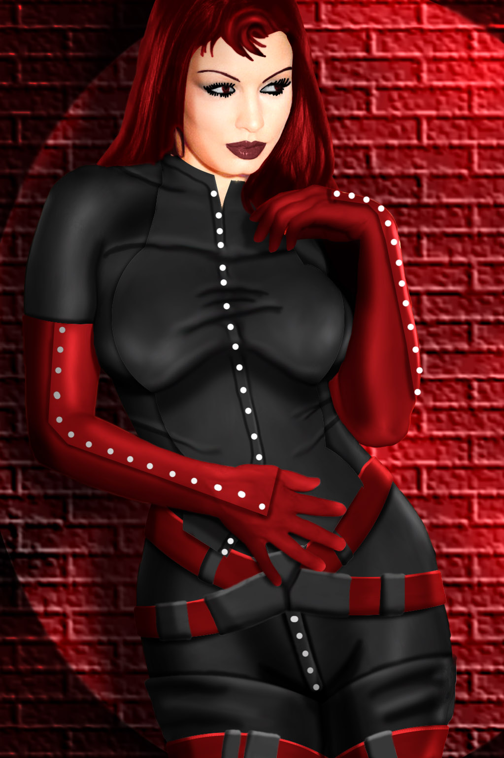
Yeah, definitely cool. Nice work on the belts and seams.
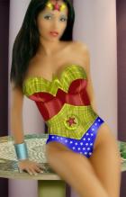
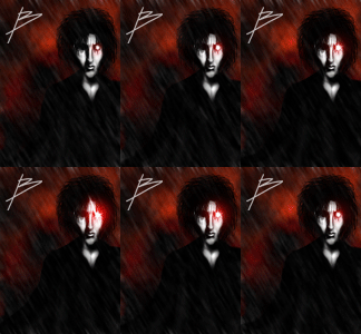
B Critique: the face is a bit faded looking, and thus the nose disappears a bit. In fact, I find your colours are often a bit flat-looking, though here it's most noticeable in the face. If that's the look you're going for then, well, please ignore me.

Otherwise, I'd suggest (assuming you're on Photoshop or something with similar tools) using brightness/contrast and/or dodge & burn to darken the shadows and brighten the highlights so as to give the image a greater illusion of depth. Your work is already very eye-catching; this would make it pop even more.

 ! Manip !
 Other Comics


 Otherwise, I'd suggest (assuming you're on Photoshop or something with similar tools) using brightness/contrast and/or dodge & burn to darken the shadows and brighten the highlights so as to give the image a greater illusion of depth. Your work is already very eye-catching; this would make it pop even more.
