Quote:
Poster: drunkendragon Posted: 2009/10/31 21:55:12
Hey, I recognize this work...glad you decided to re-visit it. That definitely looks more like Triple H/Thor. I was gonna comment on the fishnet texture, but seeing as how this is still early in production, I foresee many changes in its depth and shading. In other words, once I actually read through your entire intro, I realized this is "line work." It's looking great as usual, and I think you made great improvement not only on the constructive crits you mentioned, but on the composition as a whole. The downpour and special effects will make this piece really stand out if you dramatically light Thor himself with the lightning. Great model choice, cool background. I'm really looking forward to seeing how you rock this piece, Redd.
Thanks. I've been thinking about re-visiting that sketch. It had a lot of missed potential. The arms and legs are actually a sort of small plate armor, which will show with shading. I thought that someone might think it was fishnet. lol
Sorry I write long introductions, I like to be thorough and say everything I need to say about each piece.
Thank you, I think it's an improvement. but the editor and consumers opinions matter most. That is why I ask you guys what you think, and it always helps. You guys catch so much that I just miss. I love it!
As you know from the on-going Battle painting I'm working on the elements. I really hope this will turn out. Thanks for the ideas and encouragement DD, I always appreciate it.
much love
~Redd




 ! 2D Art !
 Marvel Comics
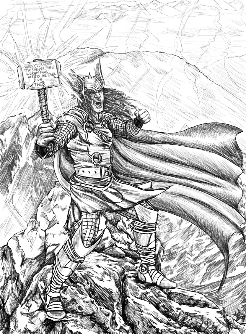



 It also sounds like you have some great ideas that should make for a very compelling image which I really look forward to seeing completed. I'm just trying to think like a comics editor here so please don't misunderstand me but considering David's previous crits, you may wish to consider things when doing this type of image like having Thor's hammer raised more up toward the skies both for the purpose of creating a more dynamic pose and implying it's connection to the environment (thunderous skies above). You might also consider a less straight on point of view to increase dynamic sense. I really think this is quite a wonderful piece and your art is terrific so if you think I'm being too nitpicky or I'm way off base in trying to make helpful suggestions, let me know and I'll be quiet.

