Oh! WOW!
Well thank you for taking the time to give me such a detailed critique.
I will make changes:
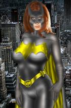
Base Drawing: I see what you mean by the chin. Something had been bothering me about the face, I thought it was the nose. Then preceded to ignore it.
lol As for the lips it's the shading. I do those all the time but I messed up on the shading and was lazy about zooming up and fixing it. But I will.
The cheeks are alright I fiddled with them for some time. It is the jaw line that is throwing you off. Me too apparently.
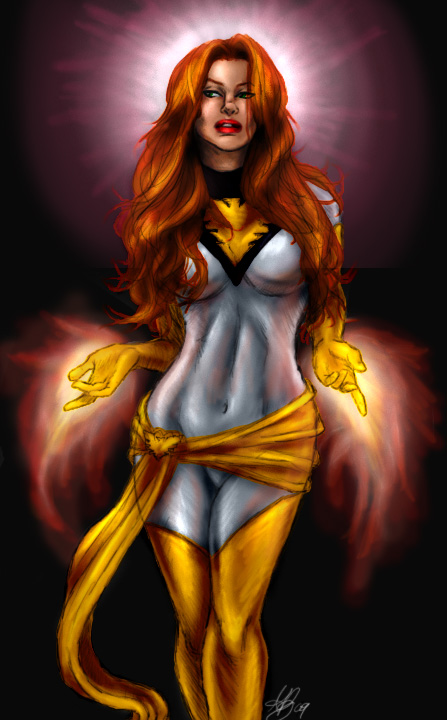
Thank you with the body. That take practice, that's how that part becomes a quicky. and luck. I was really happy that I didn't have to go over that a billion times. As for the leg, she's got her legs crossed and is shifting her weight like in a walk. But I still see what you mean. The lines under the cloth emphasizes that. I think when those get taken out it will look better.
Coloration: I actually did not like the color of red I chose for her lips but now I do. I think taking the pink out will help for why I didn't like the shade. As for the red hair I have red hair and have done to many self portraits to not be good at it. That's my shade of red too, it's the shade I tend to do, I also just like coloring more red heads cause they stand out, there is just something different about redheads that I like more...not to be narcissistic.
I will take the lines on her hips out, I see what you mean and I don't like it either. I have a tendency to do that with cloth cause I like the bodies so much.

The white just turned out well, I'm happy with it too. The halo is her telekinetic power, since being the phoenix I notice that part get's over looked. I felt it really filled the space well and created a triangle focus point with the fire. It creates an instant draw for the eye to her symbol and face. It turned out a bit religious looking but in a way the phoenix is a religious thing, built into the core of the major religions. So I left it.
So thank you so much for your wonderful review and critiques. I know it's a high expectation but I look for this in anything I post. It helps me realize things I should and should not continue to do. Therefore I grow as an artist. That is why I like to write reviews like this to help others grow. In all truth the Heromorph community has been better about that than the Deviantart community, ironic huh? lol
As for this being a Quickie it is for me.
Most of my paintings take from 2 days to 5. The manipulations take a day to 2 days depending on how far I want to go. Usually since I don't get paid for them I don't spend all my time on them. So this taking 20 minutes to draw, 10 minutes to shade in gray scale and 10 minutes to turn to color is a quickie.
(this is all in Photoshop CS3)
If you want to know I did the line work over top a gray background. Then I shaded and highlighted with an opaque brush. TO get the extreme light and dark I used the burn tool and the dodge tool. For colors I did a base color for each set of colors on a separate layer. (golds all on one layer, oranges on one, whites...etc) Then I duplicated those. I put one set all on one layer and chose one blending mode for that below the gray scale layer which is now opaque. Then I chose an appropriate blending mode for each color base layer. Depending on how it looked I added burning and highlighting on each. Then I did the fire and telekinetic power on one layer in only color burning and highlighting when needed. Flattened it and signed it, and called this a done piece. Sounds like a lot but it's not.
So I hope that helps. As for your complements thanks you very much. As for your critiques I'll fix the things you stated and re-post this. (there is a way to edit a photo and re-post the actual photo with out loosing the comments.)
Once again thank you so much I appreciate this so much.
I'll let you know when I post another one.
~Redd


 ! 2D Art !
 Marvel Comics






 You're kidding me right? Okay, now I feel bad. The only quick part I got was from the pencils part of the pic, not the coloration.
