| Poster
| Thread
|
| Dark_Knight_DK |
Posted: 2012/10/1 0:25 Updated: 2012/10/1 0:25 |
Bat Junkie...and who took my meds???   Joined: 2003/8/18 From: Mexico City (we don't wear hats) Posts: 2623 |
 Re: BOP Again I like it nice work!
|
|
|
| Shocking_Rom |
Posted: 2009/6/24 8:36 Updated: 2009/6/24 8:36 |
superhero   Joined: 2004/2/5 From: Ryker's Island :-( Posts: 256 |
 Re: BOP Again Excellent  a 10 from me |
|
|
| Krasch |
Posted: 2009/6/12 9:50 Updated: 2009/6/12 9:50 |
Gold Member   Joined: 2006/5/14 From: Posts: 259 |
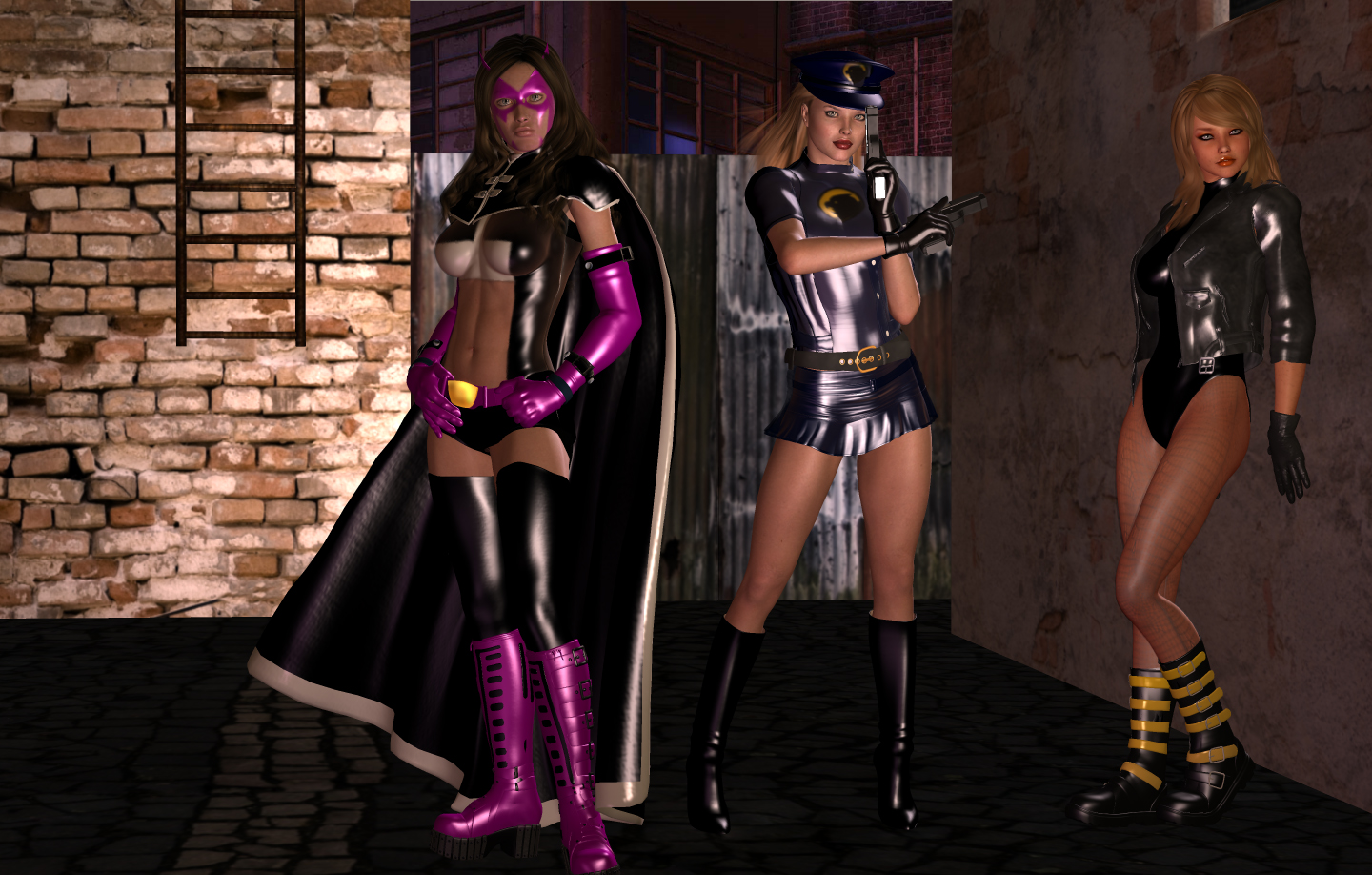
 Re: BOP Again Now this is much better. Yes one COULD crop more on the left side, but having them dead centre is poor composition too so a bit asymmetrical is just fine.
The differences between the girls is subtle, yet well done and good to see.
|
|
|
| drunkendragon |
Posted: 2009/6/12 7:43 Updated: 2009/6/12 7:43 |
Gold Member   Joined: 2008/11/4 From: Indiana, yeah, Indiana, stop laughing Posts: 1474 |
 Re: BOP Again How do you easily improve on a great image? Just like this!
Nicely done. Better detail on the close up shows off the differences in each character's face and body.
Plus it's always a good thing to zoom in on the babes.
I can definitely see why you would use this as wallpaper!
I look forward to more.
|
|
|
| spiderpity |
Posted: 2009/6/12 7:09 Updated: 2009/6/12 7:09 |
vigilante   Joined: 2008/10/13 From: Posts: 4 |
 Re: BOP Again I use it for wallpaper thas why i keep the left side
|
|
|
| OCP |
Posted: 2009/6/12 5:43 Updated: 2009/6/12 5:43 |
Wizard of Lasagna (Mod)   Joined: 2007/5/20 From: From the Other Side of the Ocean Posts: 3461 |
 Re: BOP Again Much Better.   Keep'em comin'  |
|
|
| pijon |
Posted: 2009/6/12 1:40 Updated: 2009/6/12 1:41 |
Moderator   Joined: 2006/7/18 From: United States Posts: 6363 |
 Re: BOP Again Better for sure although could have cropped the left side for more balanced composition, Still great job... 3 very sexy looking heroines!
|
|
|







 ! 3D Art !
 DC Comics