| Poster
| Thread
|
| whiz |
Posted: 2012/5/9 1:39 Updated: 2012/5/9 1:39 |
superhero   Joined: 2010/7/19 From: Posts: 438 |
 Re: Sandstorm awesome !!!!!! big thanks :D
|
|
|
| Lady Heromorph |
Posted: 2012/5/8 13:50 Updated: 2012/5/8 13:50 |
Official Award   Joined: 2005/10/21 From: Mammoth Mountain Posts: 5502 |
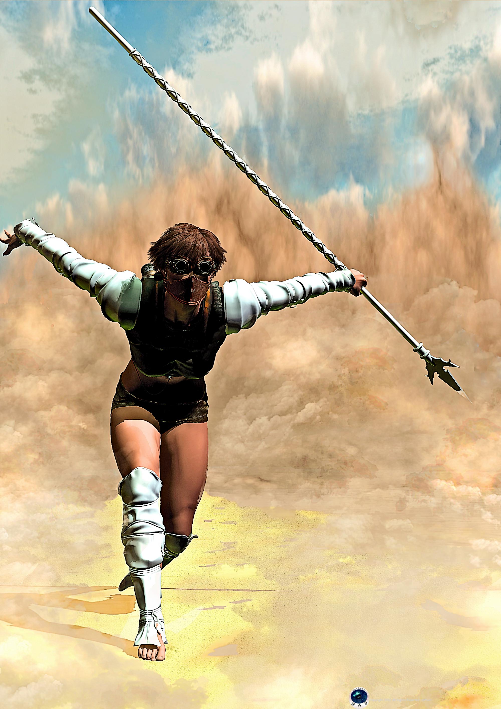
 Re: Sandstorm Congrats. This image made Lady Heromorph's Top Images of the Week ending May 05th, 2012.  |
|
|
| whiz |
Posted: 2012/4/26 0:37 Updated: 2012/4/26 0:37 |
superhero   Joined: 2010/7/19 From: Posts: 438 |
 Re: Sandstorm thanks bro :)
|
|
|
| pijon |
Posted: 2012/4/25 19:51 Updated: 2012/4/25 19:51 |
Moderator   Joined: 2006/7/18 From: United States Posts: 6363 |
 Re: Sandstorm There is a nice sense of mystery to the character and the way this piece illustrates her power... WOW! Great job!  |
|
|
| whiz |
Posted: 2012/4/25 5:14 Updated: 2012/4/25 5:14 |
superhero   Joined: 2010/7/19 From: Posts: 438 |
 Re: Sandstorm lol! well you could always revamp her.who knows she could be the next comic icon
|
|
|
| Thayne |
Posted: 2012/4/24 13:13 Updated: 2012/4/24 13:13 |
Dazed and Confused... mostly Confused   Joined: 2004/7/15 From: usa Posts: 3290 |
 Re: Sandstorm lol I had a character named Sandstorm back when I was a kid. It looked more like an orange and black Scarlet Witch tho.
|
|
|
| whiz |
Posted: 2012/4/24 11:50 Updated: 2012/4/24 11:50 |
superhero   Joined: 2010/7/19 From: Posts: 438 |
 Re: Sandstorm big thanks !:) i appreciate the tips.good eye...looking at it full sized i see what you mean. i'm currently working on a second image so the tips will come in handy.i do hope it does well too i'm really proud of how it turned out :)
|
|
|
| CRF |
Posted: 2012/4/24 5:38 Updated: 2012/4/24 5:38 |
vigilante   Joined: 2012/4/6 From: St. Catharines, ON CA (20 minutes outside of Niagara Falls) Posts: 42 |
 Re: Sandstorm This image is wonderfully dynamic. The painterly effect adds so much to the image as well!
If I may make one small sugestion? Although the granular effect used on the floor compliments the image with a strong opposing texture, you may want to limit it to the foreground and directly under the subject's feet. Extending it into the background behind the subject suggests a sharpness in focus that the model does not share, and thus becomes a little distracting.
This is a great image. I hope that you make the images of the week gallery with this. :)
|
|
|






 ! 3D Art !
 Fantasy