| Poster
| Thread
|
| pijon |
Posted: 2012/9/10 1:34 Updated: 2012/9/10 1:34 |
Moderator   Joined: 2006/7/18 From: United States Posts: 6363 |
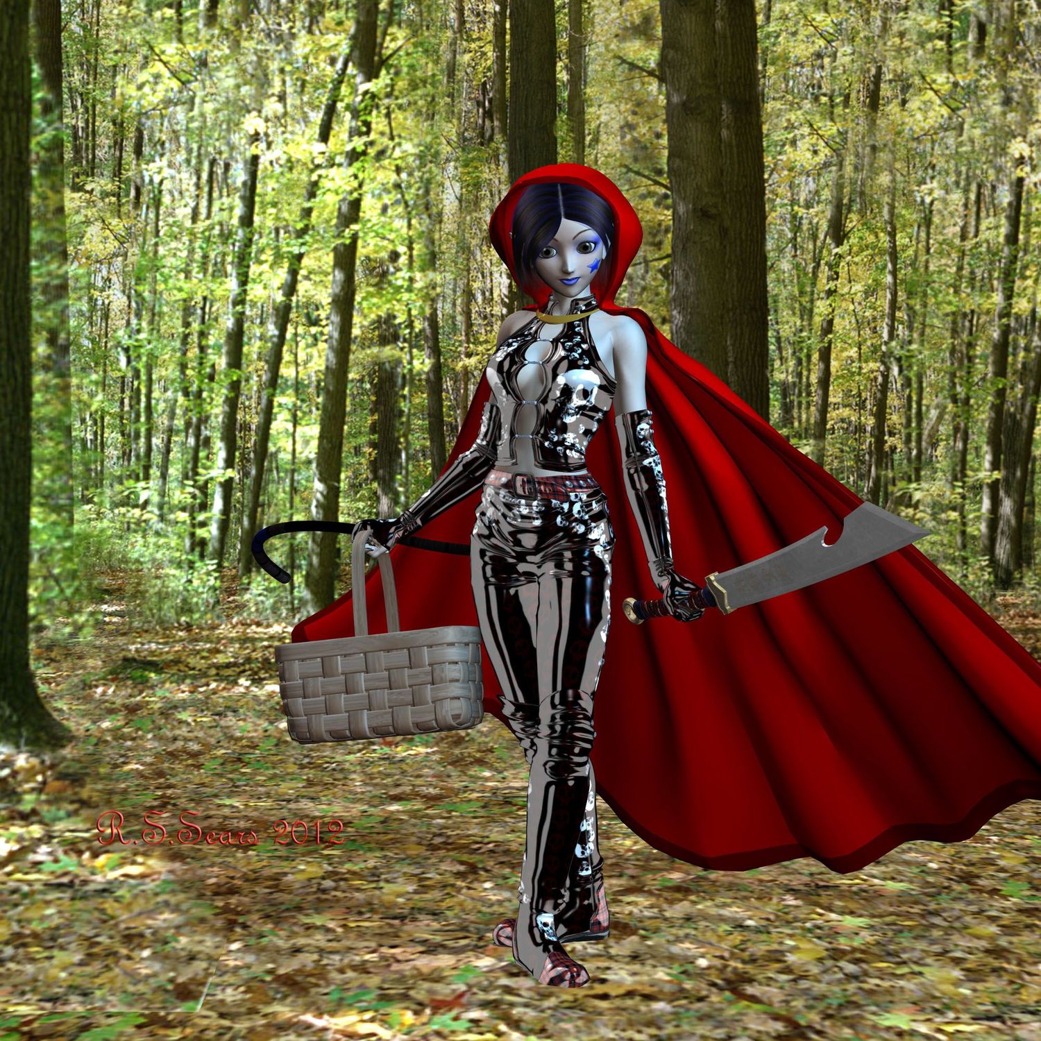
 Re: hood Great looking character, even if she does overpower the background a bit. Well done.
|
|
|
| vash99 |
Posted: 2012/9/8 3:34 Updated: 2012/9/8 3:34 |
Supreme being   Joined: 2010/3/2 From: memphis ,tn Posts: 780 |
 Re: hood Thanx
Yeah I didn't wanna overload the lighting on it as for the shadow issue I got muted
But I'm glad yall like it
|
|
|
| Dark Wanderer |
Posted: 2012/9/7 20:49 Updated: 2012/9/7 20:49 |
The Metal Shinigami (Moderator)   Joined: 2004/12/6 From: Kentucky Posts: 5149 |
 Re: hood I like the idea, there are a few things that are bugging me a little on this. 1. Lack of shadows on the feet. 2. Lighting on the figure suggest and shows a soft blue like night time, contrasting with the bright sunny background. 3. from what I can tell, the angle of the lighting on the character vs the angle of the background is off. Sunny is going from Viewer Left to Viewer Right and the soft blue light is just the opposite
|
|
|
| B |
Posted: 2012/9/7 13:55 Updated: 2012/9/7 13:55 |
The New Number 2 (Moderator-Like Guy)   Joined: 2004/5/16 From: Kamloops, BC, Canada Posts: 1366 |
 Re: hood Oooh, shiny! (That's what we're supposed to say in these situations, right?) Another cool design, keep it up.
|
|
|






 ! 3D Art !
 Fantasy