Main Menu |
Search |
HM's Goodies and such |
Become a Gold member! |
Click Here for more Details about gold Memberships or click the Icon above to donate. Remember to include your Username with donations. |
Random Images |
Top Posters |
||||||||||||||||||||||||||||||
|
Who's Online |
advertisements |

 ! 3D Art !
 DC Comics
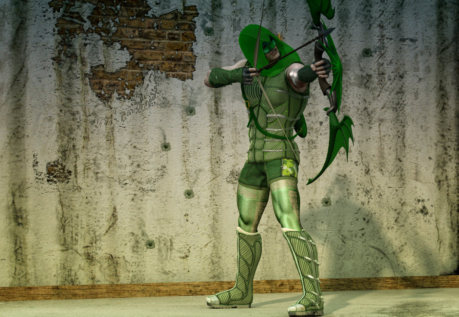


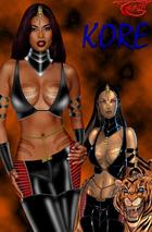
 Love the bow and the costume design.

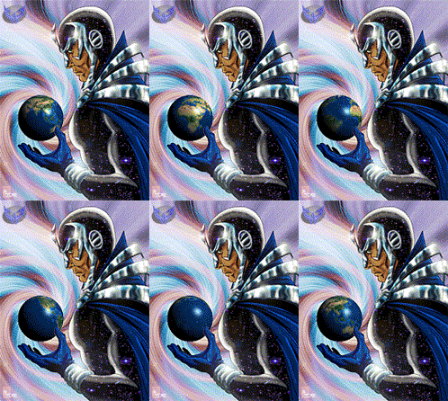
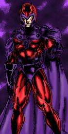
 . i love your creativity with costume designs and i'm sure if you offered some of your texture designs to your fellow h-morphers you'd get a great response. the composition of this is what bugs me the most...you've got so much wasted space and i think you could have really made this image pop by darkening the area around him and putting one spotlight centered on him so he could cast a shadow on the huge wall behind him.

