| Poster
| Thread
|
| Dragondack |
Posted: 2015/12/5 22:39 Updated: 2015/12/5 22:39 |
The Great Eternal Dragon   Joined: 2004/2/9 From: Edmonton,Alberta,Canada Posts: 11326 |
 Re: Challenge WoW! Catfight!  |
|
|
| B |
Posted: 2012/12/23 15:52 Updated: 2012/12/23 15:52 |
The New Number 2 (Moderator-Like Guy)   Joined: 2004/5/16 From: Kamloops, BC, Canada Posts: 1366 |
 Re: Challenge Yup. Much, much better.  |
|
|
| StarChild |
Posted: 2012/12/23 12:55 Updated: 2012/12/23 12:55 |
Shaper of Worlds   Joined: 2004/4/5 From: Matteson, Il Posts: 3909 |
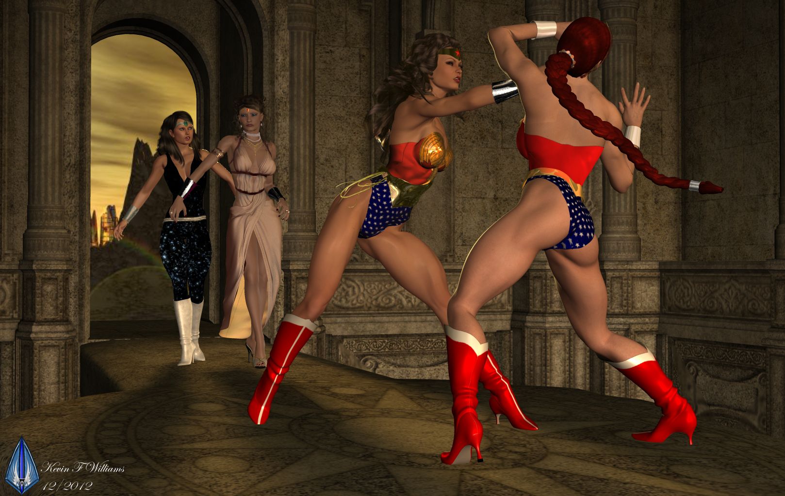
 Re: Challenge i agree. vastly improved on original image. better poses, facial expressions and the upgrade on diana's armor. my only nit is the ommitance of artemis' face considering its supposed to be an image featuring all the wonders..she comes off as an also-ran. still nice to see you took the criticism to task. great work!
|
|
|
| Dark Wanderer |
Posted: 2012/12/23 7:54 Updated: 2012/12/23 7:54 |
The Metal Shinigami (Moderator)   Joined: 2004/12/6 From: Kentucky Posts: 5149 |
 Re: Challenge Vast improvement on this. I like it.
|
|
|
| B |
Posted: 2012/12/21 14:05 Updated: 2012/12/21 14:05 |
The New Number 2 (Moderator-Like Guy)   Joined: 2004/5/16 From: Kamloops, BC, Canada Posts: 1366 |
 Re: Challenge In addition to what DW and Star said... I find punching-WW's torso really weird and stretched looking. And I think this image could really benefit from some cropping, as there's a huge amount of empty space in the background.
|
|
|
| StarChild |
Posted: 2012/12/21 12:19 Updated: 2012/12/21 12:19 |
Shaper of Worlds   Joined: 2004/4/5 From: Matteson, Il Posts: 3909 |
 Re: Challenge gotta agree with DW's comments...what concerns me more is Hippolyta's static expression. its almost like she walked in expecting to see what she saw. and i'm rather curious why you chose to use this rather dated WW skin texture rather than one of the amazing WW costumes available?
|
|
|
| Dark Wanderer |
Posted: 2012/12/21 7:37 Updated: 2012/12/21 7:39 |
The Metal Shinigami (Moderator)   Joined: 2004/12/6 From: Kentucky Posts: 5149 |
 Re: Challenge 1. Expression is needed on two of the characters. Particularly the one delivering the Punch. She has a Ho Hum I am so tired look.
2. Bracers on the one delivering the Punch need to be fixed.
3. Lighting would be nice to see some shadowing
4. Leggings on the two fighting? May be better to remove those from the image.
|
|
|



 ! 3D Art !
 DC Comics