Main Menu |
Search |
HM's Goodies and such |
Become a Gold member! |
Click Here for more Details about gold Memberships or click the Icon above to donate. Remember to include your Username with donations. |
Random Images |
Top Posters |
||||||||||||||||||||||||||||||
|
Who's Online |
advertisements |

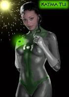

 ! 3D Art !
 Original Characters
![Unicorn Comics One-Shots - Captain Galaxy [mock cover] Unicorn Comics One-Shots - Captain Galaxy [mock cover]](http://heromorph.com/heromorph2/uploads/photos4/21136.jpg)


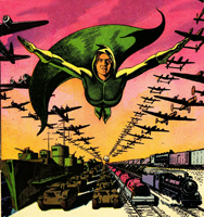
 A small detail about Cap's pose tho... because he is leaning back like that, his weight should be on his heels, thus the right one shouldn't be raised. Still, awesome mock cover... more, please!!!
