I gotta say, ya really made me think on this one Bub, 'cause this review required a bit of thought

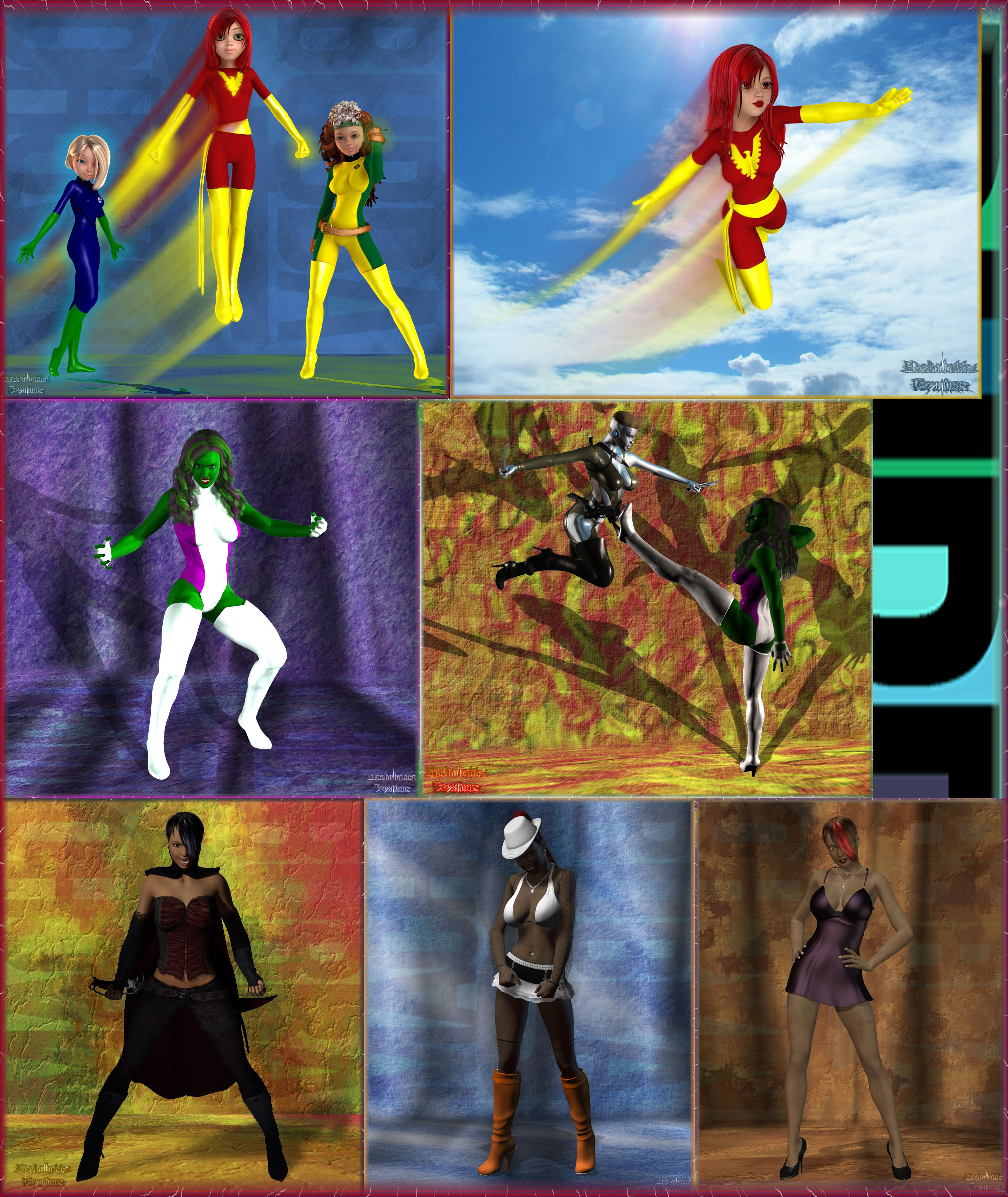
There's a lot of pics here so I'll do a bit of group critiquing so I don't end up writing a book on it

Let's start with character because IMO it's one of the more important aspects anyway... terrific job! Great sense of character in all and it's (to me) the most essential part... cheers on a job well done! Next, let's talk lighting... IMO for basic character shots like these, lighting mostly serves to create a sense of depth and volume to the characters and again, for the most part you've done some really good work here but the 5th pic (reading left to right, top to bottom) looks a bit flat, particularly compared to the others. My favorites are 2,4 and 6. My biggest problem with this piece is the title... I don't know, it's probably just my own dogmatic thinking but "collage" brings to mind either a main theme or something more random but yours seems to go a bit deeper, having a separate theme for each layer... I'm thinking something more like a "triple-decker"

Overall: really good job!




 ! 3D Art !
 Original Characters




 There's a lot of pics here so I'll do a bit of group critiquing so I don't end up writing a book on it
  Let's start with character because IMO it's one of the more important aspects anyway... terrific job! Great sense of character in all and it's (to me) the most essential part... cheers on a job well done! Next, let's talk lighting... IMO for basic character shots like these, lighting mostly serves to create a sense of depth and volume to the characters and again, for the most part you've done some really good work here but the 5th pic (reading left to right, top to bottom) looks a bit flat, particularly compared to the others. My favorites are 2,4 and 6. My biggest problem with this piece is the title... I don't know, it's probably just my own dogmatic thinking but "collage" brings to mind either a main theme or something more random but yours seems to go a bit deeper, having a separate theme for each layer... I'm thinking something more like a "triple-decker"


