Thanks everybody! I generally try and pick something challenging that I think maybe I can pull off and that was definitely the case here.

Also I'm always tickled when I go obscure and some folks actually remember these odd picks so cheers, you've earned a comics knowledge badge with me.

Quote:
DW wrote:
I never knew of this character. Good work on this. I STILL need to learn Hexagon
You know I'm a little proud that I managed to be obscure enough that you didn't know.

Yeah, bud... we definitely gotta get you going in Hexagon! I'm no expert and need to learn a lot myself but I'm sure I could help you get going in the right direction

It's nice to be able to build parts when you can't find 'em. BTW, did you check out my last one? Nothing great as an image but building Axel's cyborg robot body in hexagon then rigging it to pose in D/S, now that part was fun!

Quote:
B wrote:
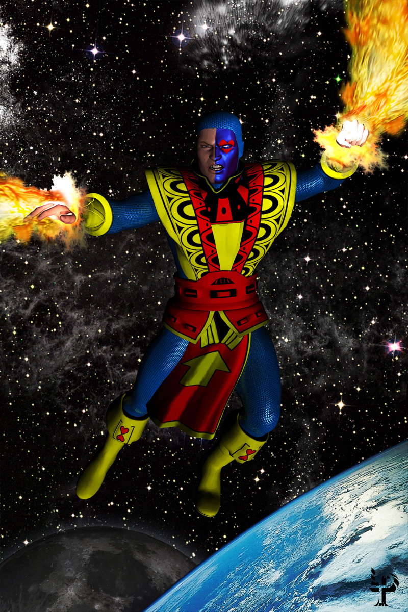
Jack of Hearts! In his awesomely goofy 1970s outfit, to boot! Now THAT'S obscure... I salute you, sir!
Cool pic too; nice pose, funky power effects, nice simple monochrome(-ish) background that doesn't distract from the character. Good stuff all round.
Critique: I think it could benefit from a contrail or some rocket flames or... something... to show movement. As it stands, it seems as though he's very strangely hovering in midair for no obvious reason... or maybe standing on an invisible shelf. I'm not quite sure how to reconcile that with the jets from his arms, admittedly...
Nitpick: IIRC, aren't his power effects usually coloured pink/red?
Yeah, it was mostly all about that wacky costume here

I don't know... I really liked it. I thought it iconic and ornate and stylish and unique as far as supers costumes go. I think Jack's problem was that he was always a little too eathbound to succeed. I think the outfit would have been fine among Marvel's space operas (like Silver Surfer, Captain Marvel and Gladiator type) titles but he always admittedly seemed a bit too cirque du soleil for urban crimefighting with the Avengers.
Critique: Strangely enough, this echoes a conversation I'd had decades ago at a party with fellow comic geeks about the cover to which this pays homage. That would be
Jack of Hearts #1 (4 issue mini series) drawn by George Freeman (legendary Captain Canuck artist!). Originally I'd considered doing a full scale recreation of this but movement limitations of figure and costume prevented me from getting anywhere near that cool or dynamic. Much of this changed composition owes to another rejected notion to give it J and heart corners, more like a tarot card. So although it is a bastardized and borrowed pose

I did think the loincloth adds a proper albiet subtle sense of direction in much the same way a cape would. Still, back those many years ago, I remember people making the same plank comment about Freeman's original pose so I must say, in spite of my thoughts on directional loin clothes, yours is a very valid impression. Perhaps tilting that left foot back to give more of an impression of flying might help although I thought it something of a counterbalance reaction to blasts being blown out by his hands.
Nitpick: Dammit, you just won't let me get away with a thing, will you??!!

Actually, I'm most impressed that you were correctly able to call me out on blast color!

You'll have to pardon me, I was so happy over having figured out 2 new ways (one in D/S, one in PS) to use apophysis fractals in generating those blaster FX that I'd totally forgotten about blast color until it was too late!



 ! 3D Art !
 Marvel Comics




 ...and damn, Ms. Vee... that's a really nice thing to say indeed... thank you! ... and um... yeah, if Marvel should make there way over here to take a look... let it be known I do reboots too... gotta terrific story lined up if they need someone to write or plot that Jack book!



 Actually, I'm most impressed that you were correctly able to call me out on blast color!

