| Poster
| Thread
|
| Bandwidth |
Posted: 2014/4/22 9:36 Updated: 2014/4/22 9:36 |
Official Award   Joined: 2008/7/13 From: Canada Posts: 556 |
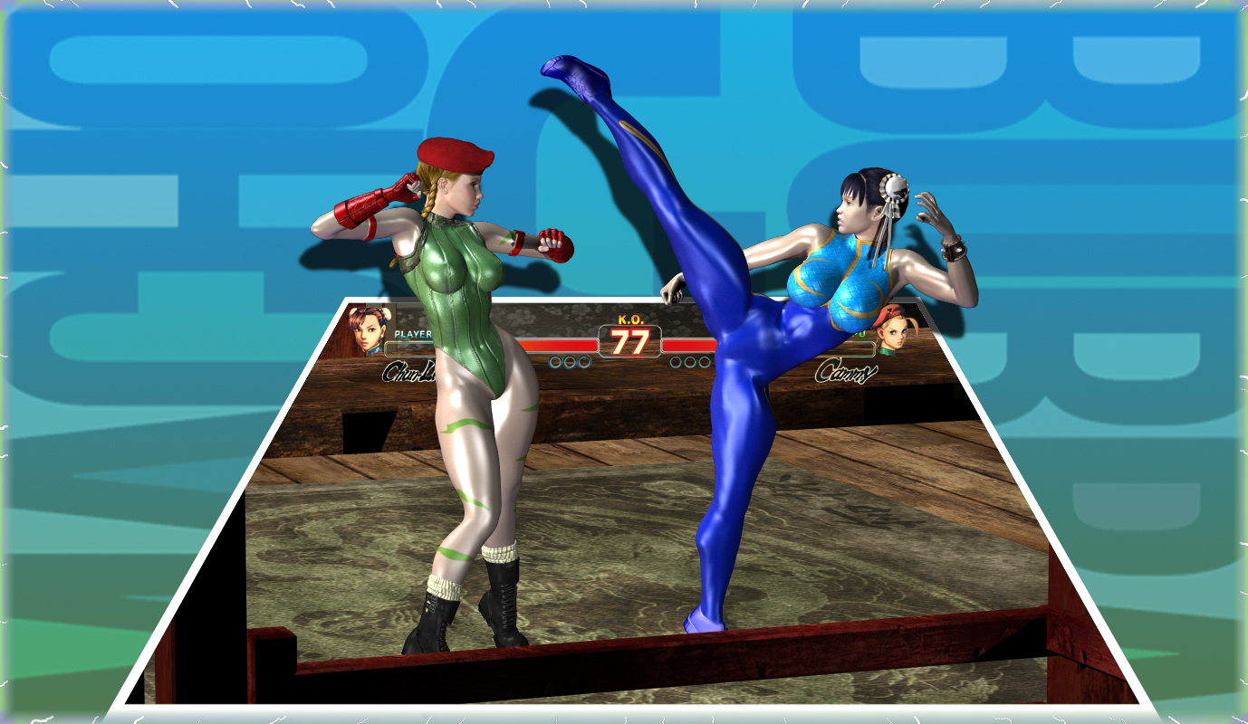
 Re: Chun Li Vs. Cammy Redux.... Congratulations, this image made it to the Top Images from the third week of April, 2014
|
|
|
| StarChild |
Posted: 2014/4/16 10:31 Updated: 2014/4/16 10:31 |
Shaper of Worlds   Joined: 2004/4/5 From: Matteson, Il Posts: 3909 |
 Re: Chun Li Vs. Cammy Redux.... i agree. since youve done the background in a double planar style..the shadow casting kinda ruins the whole idea. the characters are fantastic though. i would have made the fight bar larger and incorporated it into the foreground though.
|
|
|
| pijon |
Posted: 2014/4/16 10:14 Updated: 2014/4/16 10:14 |
Moderator   Joined: 2006/7/18 From: United States Posts: 6363 |
 Re: Chun Li Vs. Cammy Redux.... Much improved! Good job although I think you should have gotten rid of those shadows altogether. The shadows are cast as though on a wall directly behind the women which flattens the image a little, taking away from that sense of their breaking out of the game into a more expansive environment. Still, lots of good things going on, and it's a good design and idea well executed. Well done.
|
|
|


 ! 3D Art !
 Video Game


