I have run people (Notice I didn't say "Artists") because of my constructive criticism. Artist should be able to hack it... "people" just get their feelings hurt and take their ball and go home. Lets see what you are.

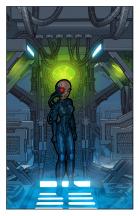
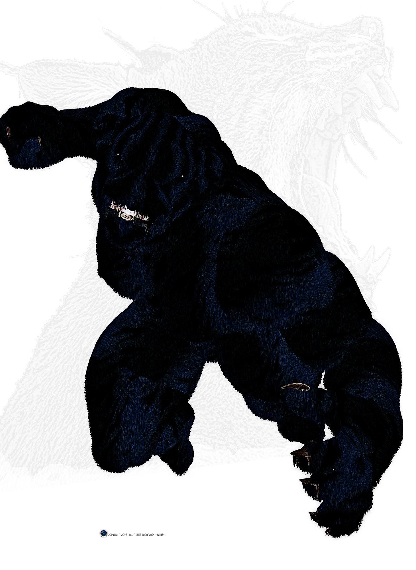
I am glad that you put this character on a white background of he would have just disappeared. He is too dark. He needs better lighting.
Hollywood lighting, at it's most basic, is 3 lights. Key, Fill, Back. This image is missing at least 2 of them.
I am not sure if you used a blue light, or if the light you are using is causing the hair to highlight blue. Either way, it is a good choice. You might want to bring the light more towards his face... OR, elevate it to look like it is the moon. Then, on the opposite side, try using a complimentary color for a fill light. Also, using a complimentary color, such as an orangish color will develop action. Almost like he is coming out of the darkness on to the glow of a car interior. Or into a softly lit street. Most of the lights on the streets shine yellow to orange. If you pull off a good Key and fill light, it is likely that you will not need a back light. BUT, it has been proven to work for centuries (have movies been around that long) so Hollywoood does know something when it work. This image could go from "Meh" to "F*K Yeah" with just some lighting tweeks. When I was in school for computer animation, almost 65% of our grade was on how we lit the scene. Lighting is crucial. I am sure there is a tutorial out there that could make this image ROCK.
Like I said, I don't hate this image... I see potential... I would just like to see it in a different lighting.


 ! 3D Art !
 DC Comics






 Great job on this badass werecat of a grandson! Great looking pelt too!

