| Poster
| Thread
|
| Dragondack |
Posted: 2006/6/1 20:33 Updated: 2006/6/1 20:33 |
The Great Eternal Dragon   Joined: 2004/2/9 From: Edmonton,Alberta,Canada Posts: 11326 |
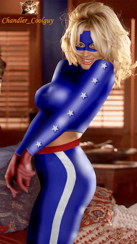
 Re: Starspangled Kid By Chandler_COolguy  ~~Real Knockout of a picture!  |
|
|
| Z71 |
Posted: 2004/8/2 10:59 Updated: 2004/8/2 10:59 |
sidekick   Joined: 2004/2/13 From: Belgium Posts: 53 |
 Re: Starspangled Kid By Chandler_COolguy Good. I like the reflects on the catsuit.
|
|
|
| Jover |
Posted: 2003/10/20 21:03 Updated: 2003/10/20 21:03 |
mutant   Joined: 2003/8/18 From: Posts: 116 |
 Re: Starspangled Kid By Chandler_COolguy I didn't get to see the first version, but this one is very nice. The stripes are smooth and I like way you worked the mask under her hair. Good job!  |
|
|
| Winterhawk |
Posted: 2003/10/19 20:53 Updated: 2003/10/19 20:53 |
Guardian of the Great White North (Webmaster)   Joined: 2003/8/17 From: Canada Posts: 6812 |
 Re: Starspangled Kid By Chandler_COolguy better, this version is better. i agree with gouge about how to put the star in. it most likely would be easiest to draw it in with the correct perspective.  |
|
|
| Chandler_CoolGuy |
Posted: 2003/10/19 5:55 Updated: 2003/10/19 5:55 |
'Cool' is my middle name,first name Un   Joined: 2003/8/17 From: India Posts: 45 |
 Re: Starspangled Kid By Chandler_COolguy I will try tht out the way u have said...and tell u how it came out... thanx for the tip... the new modifications are all ur tips.. and owe u a lot for helping me out..Thanx a lot bro...(gouge)
chandler
|
|
|
| Gouge |
Posted: 2003/10/19 5:51 Updated: 2003/10/19 5:51 |
mutant   Joined: 2003/8/18 From: Posts: 115 |
 Re: Starspangled Kid By Chandler_COolguy much better! To bad you took down the old pic, it'd be nice to have a side by side comparison.
As for the star on chest, it's realy very dependent on the pic. with this pic if you started with a basic star, you rotate it about 45 degrees to point it tords her head. then use free transformation and sqeeze it down almost flat since you'd be seeing it almost on edge. There is not much of a "valley" between the breasts on this pic, but you'd probably want to account for the slight dip between the breasts by using the liquify -"pucker" tools to pull the star in on itself at that point. when it gets that compicated sometimes it's just easier to draw it freehand though. It's all about trying to visualize how things would look. Here you'd only see the top star point, the 2 on the right,some of the middle, and maybe only a hint of the left points.
|
|
|
| Dark_Knight_DK |
Posted: 2003/10/19 1:08 Updated: 2003/10/19 1:08 |
Bat Junkie...and who took my meds???   Joined: 2003/8/18 From: Mexico City (we don't wear hats) Posts: 2623 |
 Re: Starspangled Kid By Chandler_COolguy well my friend: The 4 on sue was easy I used a fantastic four logo I found on the web, and then I disorted, skewed and rotated to get the perspective I needed, and when I like it I used a quick mask on the base pic with the 4. And the V cut on her neck I did it by myself meaning "drawing it" A tip, for the logos try to use a base pic, like the 4, the "s" for superman or a star (depends on what you need), and then give it the perspective you want in the quick mask, and don't forget that the imagination is important, you can do the star, just try to picture how the star should be in that girl (look in your comics a similar position). By experience the stars are difficult. When you have experience you no longer need the base pic for the logo (I still no have that experience)   |
|
|
| Chandler_CoolGuy |
Posted: 2003/10/18 13:36 Updated: 2003/10/18 13:36 |
'Cool' is my middle name,first name Un   Joined: 2003/8/17 From: India Posts: 45 |
 Re: Starspangled Kid By Chandler_COolguy Hey another thing i wanted to ask you Dark knight... wat plugins do u use as well as filters... I would like to know how u did tht 4 emblem on Sue Richards as wel as the v cut on her neck. Cause am planning a Sue richards next
chandler
|
|
|
| Chandler_CoolGuy |
Posted: 2003/10/18 13:32 Updated: 2003/10/18 13:32 |
'Cool' is my middle name,first name Un   Joined: 2003/8/17 From: India Posts: 45 |
 Re: Starspangled Kid By Chandler_COolguy Well...i couldent find a spot to place her chest star...there dosent seem to be much space left since shes kind of hugging herself and her boobs are too much together.. so i am not able to use the star tool for the chest star.
Wat do u suggest i could do for that...i am clueless..
chandler
|
|
|
| Dark_Knight_DK |
Posted: 2003/10/18 12:16 Updated: 2003/10/18 12:16 |
Bat Junkie...and who took my meds???   Joined: 2003/8/18 From: Mexico City (we don't wear hats) Posts: 2623 |
 Re: Starspangled Kid By Chandler_COolguy Better, but I still miss the star on her chest
|
|
|




 ! Manip !
 DC Comics


 ~~Real Knockout of a picture!

