| Poster
| Thread
|
| Quinn |
Posted: 2004/3/8 10:28 Updated: 2004/3/8 10:28 |
sidekick  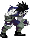 Joined: 2004/1/31 From: Posts: 62 |
 Re: I'll take that cent and raise it by a nickel I do like your style, CK, but in this picture I think the style gets in the way of the overall impact. The Punisher figure is slightly too distorted for my tastes. I'd like it just slightly crisper, without losing the style you've become known for.
I loved the X-Men cover, but this one (as others have noted) isn't quite as sharp (but damn, still very good--bastiche :P) and is bit busier in the background than that earlier work.
I certainly don't think you should suddenly start doing "bunny pose" female manips if that's not your bag, but I would like to see some of the work just a little sharper in the image, with the art maintaining your style without being "over-stylized."
As much as I admire (scratch that--I ENVY) the work of some of those who do straight, posed manips, I tend to look more for something that I can somehow try to make it look like it's part of a story... for you, the cover art and stylized look is working. Don't want you to change that if you're having fun with it hehehe
Don't know if that makes sense?
At any rate, this is still great stuff. Look forward to more :)
|
|
|
| Winterhawk |
Posted: 2004/2/6 23:46 Updated: 2004/2/6 23:46 |
Guardian of the Great White North (Webmaster)   Joined: 2003/8/17 From: Canada Posts: 6812 |
1 more cent Quote: Poster: CEREAL_KILLER Date: 2004/2/6 7:43:33
Winterhawk you’re going to have to let it go; your campaign to have me become a more traditional manipper is falling on deaf ears. There are far too many traditional manippers on this site and if I’m to stand out I have to be different (if I can’t be great). Although I will readily admit that I have not perfected my use of the filters to my liking yet. I am not really wanting you to become a regular maniper. i just would like one picture. just one. I actually really like your style and now that i am familiar with it, i would recognize one of picture out of a crowd. your conceptual pieces are pretty cool. and i think you are definatly very good at what you do, i just would like to see a variation from the normal (your normal). I myself have strayed from my normal a few times. I normally make hot chicks in tighter then tight suits but every once in awhile i do something a little new and a little different. I find that when i do something different is when i learn the most. My joker and Poison ivy pictures were both conceptual and i learned more from them then alot of my other pictures. As an artist, It is important not to get stuck in a place of compliance with yourself and your style. It is important to continue to push yourself past were you are comfortable. Style is important, i agree, and unlike you i have yet to find a particular style yet. I believe that we should all let the context of the picture influence the style and not let style determine the context of the picture. Anyway, Don't get me wrong. I don't want u 2 b a traditional maniper. I just want to see what you can do and where you can go. If you were stripped from your "comfort" filters how could u make the picture still scream cereal killer. How about instead of a traditional manip you do something different, experimental, a challenge to yourself. I have talked to you about context etc.. in the shout box and in most of my new stuff, i gave those conversations some thought and have been planning my pictures as a whole, and i think you were right and improved my work. Give this some thought and dont just shut off your ears, my friend. |
|
|
| CEREAL_KILLER |
Posted: 2004/2/6 23:34 Updated: 2004/2/6 23:34 |
mutant   Joined: 2003/11/10 From: NYC Posts: 186 |
Re: THE PUNISHER #1 COVER I apperciate the kind words but I can't take credit for the concept of this pic it should all go to Tim Bradstreet (visit his website) all I did was try my best to recreate his work in my own style and stay inside the lines.
|
|
|
| se7endaze |
Posted: 2004/2/6 15:59 Updated: 2004/2/6 15:59 |
Gold Member   Joined: 2004/1/30 From: Ontario, Canada. Posts: 391 |
Re: THE PUNISHER #1 COVER I believe you have one of the best conceptual visions out there, the work is awsome......
But wot do I know, I'm just a newbie.
|
|
|
| CEREAL_KILLER |
Posted: 2004/2/6 7:56 Updated: 2004/2/6 7:56 |
mutant Joined: 2003/11/10 From: NYC Posts: 186 |
DARK KNIGHT'S THOUGHT PROCESS "I don't care what Cereal Killer says I don't have a problem with his picture and I'm going to tell him that. Who does this bastard think he is telling me to hate his work, I'll show him"!
Thank you for the praise Dark Knight you clearly march to your own drummer.
|
|
|
| CEREAL_KILLER |
Posted: 2004/2/6 7:50 Updated: 2004/2/6 7:50 |
mutant Joined: 2003/11/10 From: NYC Posts: 186 |
2 MORE CENTS ABOUT YOUR 2 CENTS Now Brick when you say mix it up, do you mean what Winterhawk means and go more traditional; if so see pervious post. If you mean mix it up in the sense of moving away from the cover creations and on to something else I am considering that. If you mean something else entirely please let me know.
Thanks for the comment
|
|
|
| CEREAL_KILLER |
Posted: 2004/2/6 7:43 Updated: 2004/2/6 7:43 |
mutant Joined: 2003/11/10 From: NYC Posts: 186 |
Re: MY 2 CENTS ON YOUR TWO CENTS Winterhawk you????????re going to have to let it go; your campaign to have me become a more traditional manipper is falling on deaf ears. There are far too many traditional manippers on this site and if I????????m to stand out I have to be different (if I can????????t be great). Although I will readily admit that I have not perfected my use of the filters to my liking yet.
That said your comments are dead on about my piece. Even as I was working on it I felt the background was too busy and the foreground need to pop more. The only problem with that was that I scanned the Punisher picture myself (with my cheap ass scanner) while I got most of the other elements of the picture on line (who????????s scans were of much better quality). Using the filters I normally use on my scan produced an unwanted effect (you were able to see the print from the underside of the Punisher picture through is clothes and arms), while the scans I downloaded on line gave me the desired effect I wanted so I made a sacrifice
The way you suggested I do the orange tint is exactly how I did it (this picture was much, much greyer before I took steps to ???????orange it up???????. As for leaving out the fire in the picture; I didn????????t even know that was fire I thought is was just a distortion of the background and figured it was a minute detail that I could leave out. Had I know it was fire I would have taken steps to reproduce it??????? Oh well.
Thank You for your critique.
|
|
|
| Brick |
Posted: 2004/2/5 22:49 Updated: 2004/2/5 22:49 |
Technophobic   Joined: 2003/10/23 From: Pacific North West Posts: 455 |
Re: THE PUNISHER #1 COVER I cant complain about your style of manip, I like it as well.
Although I do wonder what you could come up with if you mixed it up a little.
No complaints if you dont.
Geat eye.
|
|
|
| Dark_Knight_DK |
Posted: 2004/2/5 14:58 Updated: 2004/2/5 14:58 |
Bat Junkie...and who took my meds???  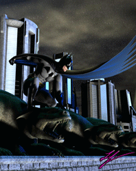 Joined: 2003/8/18 From: Mexico City (we don't wear hats) Posts: 2623 |
Re: My 2 cents I don't have any bad critic, simple... I like it
|
|
|
| Winterhawk |
Posted: 2004/2/4 23:25 Updated: 2004/2/4 23:25 |
Guardian of the Great White North (Webmaster) Joined: 2003/8/17 From: Canada Posts: 6812 |
My 2 cents Hey cereal,
Here is my review, please feel free to review any of my pictures.
It seems that this picture is another step in your development of a unique style. I know we have discussed your use of filters over the entire image to give it a specific look to it. i would still like to see a less filtered image more traditional image from you.
I think that you could have gone with a couple of different routes to give it a subtle orange glow. one method would have been to merge all layers then to make a new layer above it and fill it will a dark orange then set the layer blending to maximum and play with the opacity of the layer to get the tint right.
All and all the image has good flow to it. the eye is drawn from the top left to the bottom right.
as with your last cover the cover elements are very well put together.
The skull seems to be a little to busy. this seems to be caused by the heavy use of filters. the character in the foreground has very little details in his skin etc.. as the filter seem to have merged most of the shading and details into flat colors. but the skull behind him seems to have lines gallore. i think details should be more prominent in the foreground then the background, i think the image would work a little better if the character was more detailed and the skull was less.
In regards to the reproduction of the original art. not bad i will give you a B. you left out a major element though. the fire. the fire in the original image really helped the composition and reinforced the top left to bottom right flow of the picture. I would post a link to a good fire tutorial but all my links are gone at the moment. but i think it would have helped your image. also if the fire was included and the orange glow was applied. it would have helped the orange not look alien and would have made visual sense to the viewer.
|
|
|
| CEREAL_KILLER |
Posted: 2004/2/4 9:01 Updated: 2004/2/4 9:01 |
mutant Joined: 2003/11/10 From: NYC Posts: 186 |
THE USUAL JOKE THAT COMES WITH MY PICTURES Just in case you don't like my picture you might like this (so it isn't a complete waste of time).
The owner of a drug store walks in to find a guy leaning heavily against a wall. The owner asks the clerk, "What's with that guy over there by the wall?"
The clerk says, "Well, he came in here this morning to get something for his cough. I couldn't find the cough syrup, so I gave him an entire bottle of laxative."
The owner says, "You idiot! You can't treat a cough with laxatives!"
The clerk says, "Oh yeah? Look at him, he's afraid to cough!"
|
|
|


 ! Manip !
 Marvel Comics