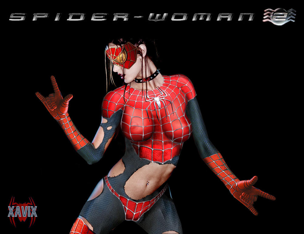
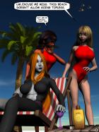
Good job on the tears and webbing, but...
The mask is obviously take from the Spiderman poster. I recommend that if you cut and paste items from well know sources that you take some time and further alter them so that the source material isn't so obvious. For example with the Spiderman mask you could have changed the eye's colour or reflection to better fit the enviorment. Remember its all in the details.
Also there are some shadowing issues (lack of) with her bikini bottoms and the mask. Some lighting considerations would make these more convincing.
I don't really want to rag on you too much. I hope some of this advice is helpful.




 ! Manip !
 Marvel Comics