| Poster
| Thread
|
| Dark_Knight_DK |
Posted: 2012/10/1 23:02 Updated: 2012/10/1 23:02 |
Bat Junkie...and who took my meds???   Joined: 2003/8/18 From: Mexico City (we don't wear hats) Posts: 2623 |
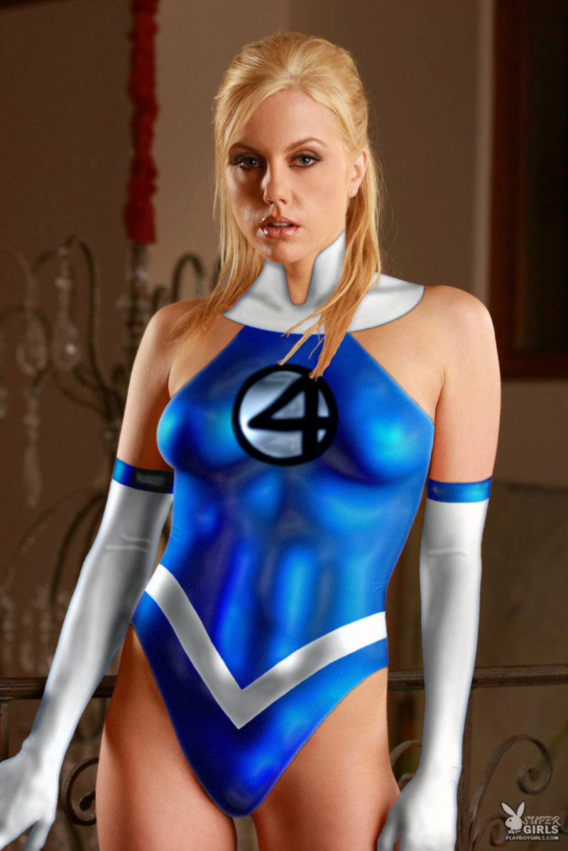
 Re: Sue Storm Good choose of a model
|
|
|
| aliens2606 |
Posted: 2008/6/27 19:04 Updated: 2008/6/27 19:04 |
vigilante   Joined: 2007/12/15 From: Seattle, Wa Posts: 13 |
 Re: Sue Storm This is one great looking Sue Storm, keep up the good work.
|
|
|
| Wolverine1607 |
Posted: 2008/6/27 1:06 Updated: 2008/6/27 1:06 |
Gold Member   Joined: 2005/8/4 From: Massillon, Ohio Posts: 715 |
 Re: Sue Storm This is still good. I would clean up the edges maybe a little more with the pen tool. Clean the shadows as well. The suit looks really high contrast which is good. But both the base pic and the suit should try and match contrast. Just some thoughts here. But still do not forget this is still good!
|
|
|
| thestarkiller |
Posted: 2008/6/26 20:30 Updated: 2008/6/26 20:30 |
Gold Member   Joined: 2008/4/12 From: Lima, OH Posts: 487 |
 Re: Sue Storm No, I didn't put in the corner logo, I just added the word SUPER to it because it was easier than removing the logo from the image.  |
|
|
| Dragondack |
Posted: 2008/6/26 12:38 Updated: 2008/6/26 12:38 |
The Great Eternal Dragon   Joined: 2004/2/9 From: Edmonton,Alberta,Canada Posts: 11325 |
 Re: Sue Storm  Well I really like it and did you put the corner logo there?  |
|
|
| chowyspizz |
Posted: 2008/6/25 23:04 Updated: 2008/6/25 23:04 |
Ring Forger   Joined: 2007/8/23 From: Mexico Posts: 1252 |
 Re: Sue Storm i think part of the problem is the shadows, instead of helping it look more real, or like the suit is part of the pic, they make little sense
|
|
|
| thestarkiller |
Posted: 2008/6/25 13:41 Updated: 2008/6/25 13:41 |
Gold Member   Joined: 2008/4/12 From: Lima, OH Posts: 487 |
 Re: Sue Storm The funny part about the "4" logo is that I didn't even draw it. I took the poser texture of the FF costume for M3 and just extracted the logo. the texture file wasn't proportionate to the model so I had to enlarge it, which pixelated the hell out of it so I had to smooth it a bit by blurring it. Guess I went too far. Oops.  |
|
|
| Wasmith |
Posted: 2008/6/25 7:55 Updated: 2008/6/25 7:57 |
Time Lord!   Joined: 2004/8/27 From: Knobblers Gob Posts: 2002 |
 Re: Sue Storm Yeah, white's a bitch. Save PG as your 50th manip!
The biggest thing I see is the clarity of the "4" logo. It looks like it was drawn with a brush with low density edges, and thus has a sort of "magic marker" appearance. If it was crisper the whole image would look better. If your drawing software has a text tool, I would suggest messing with that.
Overall a good effort, good model, I like this costume design.
|
|
|
| Drawolf25 |
Posted: 2008/6/25 7:52 Updated: 2008/6/25 7:52 |
sidekick   Joined: 2007/4/2 From: Posts: 94 |
 Re: Sue Storm Nice Pic. Hot Model.
|
|
|
| bhm1954 |
Posted: 2008/6/25 7:46 Updated: 2008/6/25 7:46 |
Hero to the stars   Joined: 2005/7/18 From: Moses Lake, Washington Posts: 2852 |
 Re: Sue Storm Overall quite good. Nice model choice and the costume looks good.  I know that white is very hard to work with but the part of the costume on her neck doesn't look right. It looks a little like it is painted on. Maybe some more shadow where it meets the skin would help. |
|
|



 ! Manip !
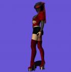
 Marvel Comics


 Re: Sue Storm


 Well I really like it and did you put the corner logo there?


