Main Menu
Search

Advanced Search
or try google search
HM's Goodies and such
Become a Gold member!

Click Here for more Details about gold Memberships or click the Icon above to donate. Remember to include your Username with donations.
Random Images
Wonder Woman Ready
SHI: REST IN THE SEASON OF THE SAKURA
Unmasked
GPE Month - Number Ten - Starforce
Top Posters
1
Dragondack
11284
2
JrMcDeath
6994
3
Winterhawk
6812
4
pijon
6363
5
Dark Wanderer
5149
6
StarChild
3909
7
OCP
3461
8
Thayne
3290
9
BikerBot
3277
10
bhm1954
2852
Who's Online
112 user(s) are online (64 user(s) are browsing Heromorph Gallery)

Members: 0
Guests: 112

more...
advertisements
Your
AD
Here!
» Sign up Today!!
» Newest Forum Posts
» advertisements
Your AD Here!

Main : ! 3D Art ! : Original Characters :  Compare and Contrast

[<   Previous  1417  1418  1419  1420  1421  1422  1423  Next   >]

Compare and Contrast
Compare and ContrastPopular
SubmitterHisstorymanMore Photos from Hisstoryman   Last Update2012/7/19 16:11
Hits2134  Comments3    
Sorry for dropping out of sight for a while, life has been... complicated as of late.  

Alrighty, I have been working on a conversion of my Killer Bee comic to 3D.  Here are two versions of page 1. One giving a comic book style feel and he other, straight up 3D.  Your feed back is appreciated.  Planning on self publishing it/  Thanks everyone  

[<   Previous  1417  1418  1419  1420  1421  1422  1423  Next   >]

The comments are owned by the poster. We aren't responsible for their content.
Poster Thread
finister
Posted: 2012/7/23 11:28  Updated: 2012/7/23 11:28
Gold Member
Joined: 2009/3/15
From: Villainous hideout
Posts: 601
 Re: Compare and Contrast
I like the one on the left, except where it's so dark you can't make out her face... unless that's deliberate. If not, perhaps the shadow enhancement is a bit too strong. Cool page!
pijon
Posted: 2012/7/19 21:34  Updated: 2012/7/19 21:34
Moderator
Joined: 2006/7/18
From: United States
Posts: 6363
 Re: Compare and Contrast
Welcome back, man! First, this new 3D version looks great so far! 
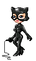
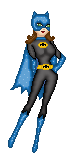
Personally, I like the one on the left as I think it compliments the very noir style of your story.
MissVee
Posted: 2012/7/19 19:54  Updated: 2012/7/19 19:54
Arch Nemesis
Joined: 2003/10/20
From:
Posts: 1447
 Re: Compare and Contrast
Welcome back. I've been doing a few pics too. I like the page on the right better, although the one on the left is more dramatic.


»
»