| Poster
| Thread
|
| Mikeall |
Posted: 2013/4/3 1:21 Updated: 2013/4/3 1:21 |
mutant   Joined: 2012/5/3 From: Posts: 124 |
 Re: Cover Art Variants Thank you LadyMorph and thank you everyone for the comments.
|
|
|
| Lady Heromorph |
Posted: 2013/3/19 12:43 Updated: 2013/3/19 12:43 |
Official Award   Joined: 2005/10/21 From: Mammoth Mountain Posts: 5502 |
 Re: Cover Art Variants Congrats. This image made Lady Heromorph's Top Images from the week ending March 16th, 2013.  |
|
|
| MsV |
Posted: 2013/3/17 14:14 Updated: 2013/3/17 14:14 |
superhero   Joined: 2008/6/11 From: Posts: 439 |
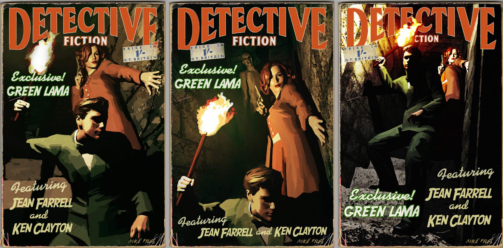
 Re: Cover Art Variants They are all great! I always love your work - makes me want to take up watercolours again! If I were the editor I'd have trouble choosing but I like the first (I think the woman is better illustratted and deserves a more up-front role)
|
|
|
| Mikeall |
Posted: 2013/3/17 2:19 Updated: 2013/3/17 2:19 |
mutant   Joined: 2012/5/3 From: Posts: 124 |
 Re: Cover Art Variants Thanks so much for the comments. I might try to put 'spooky guy' into number 3 - thanks StarClld.
|
|
|
| B |
Posted: 2013/3/16 17:53 Updated: 2013/3/16 17:53 |
The New Number 2 (Moderator-Like Guy)   Joined: 2004/5/16 From: Kamloops, BC, Canada Posts: 1366 |
 Re: Cover Art Variants Yes, they're all three excellent but the third one is tops thanks to to the great lighting and the Dutch angle.
|
|
|
| CMK24601 |
Posted: 2013/3/15 3:26 Updated: 2013/3/15 3:26 |
mutant   Joined: 2010/4/12 From: Oa Posts: 102 |
 Re: Cover Art Variants I like them quite a bit, very nicely done
|
|
|
| pijon |
Posted: 2013/3/14 20:56 Updated: 2013/3/14 20:56 |
Moderator   Joined: 2006/7/18 From: United States Posts: 6363 |
 Re: Cover Art Variants I agree with Star... there is no wrong choice here. All 3 look outstanding although if forced to pick, I think #3's POV and lighting give it a little extra pop. Awesome work all around!
|
|
|
| StarChild |
Posted: 2013/3/14 9:48 Updated: 2013/3/14 9:48 |
Shaper of Worlds   Joined: 2004/4/5 From: Matteson, Il Posts: 3909 |
 Re: Cover Art Variants well i like them all. each image has its on personal strengths.
image #2 is the most suspenseful of them all but also the one with the worst composition to me. although i love the inclusion of spooky guy creeping up behind them. there's wayy too much negative space between girlie and main guy. either he needs to come up more or she needs to move down more.
image #3 is perhaps the best lit of them with the most dramatic camera angle. had you brought the creepy guy from image #2 and put him around the corner at the bottom of the stairs i would have picked this one.
image #1 might be the best overall image and the one most publishers would use. the composition is perfect, there's no negative space, the main characters are up close and you still have a aura of drama about the image.
Evenso there's still a lot of great work going on here. you can't truly go wrong whichever direction you go in. keep up the good work.
|
|
|



 ! 3D Art !
 Other Comics