Gold Member   Joined: 2005/8/4 From: Massillon, Ohio Posts: 715 |
 Re: Female Lantern Glad you are happy here! Just like to share and I know you really like GL. Metal, lets see, I will give you as much as I know here well at least how I do this.
With clothing I go mostly with a light touch to the dodge and burn. Metal I start with a good mid tone base gray for the shape or part I am working on.
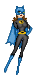
I pay attention to the lights and darks of the image itself following the light as much as I can, only difference from the clothing is I make sure this is more exagerated. It will be shiney so it will have good high contrast to the lights and darks. So where its light pretty bright and high whites, where its dark shadows more darker blacks. And the Mid tones same concept just not as dark as the lights and darks where they fall for shadows and highlights. This is the base layer. One thing I learned and just what I do, with metals as well they will reflect alot in an image if they are shiney metals, reflect more, dull metals reflect just not as clearly, so I accomidate for this as well. I pull a random image from the internet, something with maybe some of the metal colors that I am working on in it, as well as maybe some of the colors in the iamge I am creating. Sometimes this takes some searching to find. I bring this image into Photoshop, and place this over my base image, turn the layer mode to Overlay, and get a placement as a whole of the image. Then turn the mode back to normal. Now shiny metals reflect more clear and better so the reflection will be cleaner, dull metals would reflect less clear and be more blured. So that being said what I am working on as far as metal type I will use this as a guide. I then take the image, (by the way this is usually something very bright, outdoors with high contrast to the image.) and from here and go to filter, blur, gaussian blur and decide a blur amount, shiny less, dull more. This will need to be a mix a little, you will want the image to be there but not absolutly for someone to recognize. Size the iamge up or down depending on the size of shape or area you are working on, it needs to fit. Then I select the base image shape while being selected on the "metal reflection" image layer. Select, inverse. Then remove the not needed parts. Most times I have gotten into layer masking the image off. IF you hold down your ALT (PC), Option (Mac) key on the keyboard and go to the line inbetween two layers the layer above the layer under can be masked off directly to that image. One this allows me my full size base I am working with, and I can still move this around for a better fit if needed and nothing is deleted so I have to start over. I do each piece of metal individual per part. So for instance in this image the chest area was one, the left arm, the right arm, and the waist, tummy area. Four parts. I work on one at a time which is why I write the layers all down. It will allow me exact color match and duplication in the end of colors or effects if they are used somewhere else. I then circulate through the layer modes until I find something I like, usually this is color dodge, overlay, hard light. Sometimes others work, so don't hesitate to go through them all till you are satisfied, or you think this looks right. Then I turn down the opacity of the "metal reflection" so its not so pronounced. I duplicate my original layer, and change the layer mode as well on the duplicate one and bring this above the base, and reflection layer. THen turn down the opacity on this as well, I look for a couple of things, one the duplicated original helps me retain and keep all the shadows and highlights I put into effect on when I created the piece I am doing, plus I can make it shiny more so if need be. As well sometimes I go under the filter menu and go to other and choose the high pass filter, just sometimes helps exagerate the lights and darks more. I don'd do high pass everytime but I do try it and see what I get. So now we have metal gray to start that will have a reflection, not full force of an image, and I kept and maintained my highs, lows and such that I created in the original. If I need it from here, I create a new layer in this set, and label this color. THis is where I choose my color, select the shape and fill the layer from here with my chosen color. THis allows more control over saturation and color depth than just coloring the image I created. I then as well play with the opacity and blend mode for this layer, circulate through them all till I get something I like, and somtimes this layer needs to be duplicated (example I choose color for the mode and I took the opacity down to 40% this picks up my gold coloring I need, but is not quite shiny enough for my metal, I duplicate and change the layer blend mode of this one as well. Keeps my color but may make it more of the effect I am looking for. Usually when I start one piece I am working on as well I will create a new layer group label this for the part I am working on and stick all my pieces for this image in here. Helps to keep organized and as well if I have to edit or change something, or I didn't mask of a part far enough (( example 2 with this one if you are looking at it on screen, the arm on the left of the screen when I was working on this I didn't take out enough of the cuff on the arm and it was running into the leg. I can go to layer, add layer mask and add this to the group, and add or take away from a piece at will, without actually effecting the image whole, its just masked off.)) and my second layer may be 30% of the color but the mode is Overlay so I can control the saturation while keeping the color I just set with it at 40%.) Sorry here I know this is long winded, but I run some of the Adobe training classess at my work here and I have a tendancy to go on about stuff. And I love Photoshop. But the more detail the less you have to try to guess at my steps if I explain them. So hope this helps explain the process. Not saying its right but this is how I do this and create my metal in an image.
Keep in mind as well the metal reflection is an option, you don't have to use this all the time. GL I did, Supergirl I didn't. Just high contrast to darks and lights, and how shiny make a difference in use of the "metal reflection".
Even if you wanted to PM me here or send me over a peice of the part you are working on and I am more then happy to help further and share. Anything to help.
Thanks for all the comments guys, hope this is of help. I will try to create a small tutorial as well Chowy and get this over to you, may be easier to understand as well as keep for later use if needed. Once again very glad you are happy, this is what makes me happy!
|


 ! Manip !
 DC Comics


 Re: Female Lantern


 Re: Female Lantern
 Re: Female Lantern