| Poster
| Thread
|
| BatMic |
Posted: 2004/8/9 11:26 Updated: 2004/8/9 11:26 |
Hellfire Club Member   Joined: 2004/1/29 From: Scotland Posts: 408 |
 Re: HM-C2F Crossover by Dperceful & Brick |
|
|
| BikerBot |
Posted: 2004/8/9 7:07 Updated: 2004/8/9 7:07 |
Mr. The Mighty Lord *Krackaboom!*   Joined: 2004/1/13 From: The Good Earth Posts: 3277 |
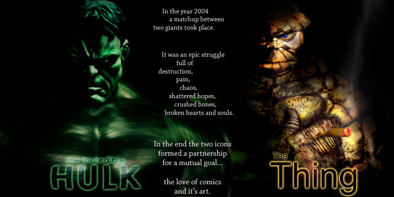
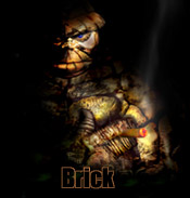
 Re: HM-C2F Crossover by Dperceful & Brick I like how Dan used his Chrome Tutorial to make the Hulk's muscles. (If you desaturate him, does he look like Collosus?)  I also like how the lettering on the Hulk has been Displaced. The Thing real-rock effect is pretty cool. I have a little problem with the rock around his eye, though. Looks like a space in the wall that they filled in with cement. Which, if that's what you were going for, looks just right! BB  |
|
|
| Flux |
Posted: 2004/8/9 2:39 Updated: 2004/8/9 2:39 |
sidekick   Joined: 2004/1/5 From: Leeds, England Posts: 82 |
 Re: HM-C2F Crossover by Dperceful & Brick This is great! fantastic effects!
|
|
|
| Dragondack |
Posted: 2004/8/9 2:31 Updated: 2004/8/9 2:31 |
The Great Eternal Dragon   Joined: 2004/2/9 From: Edmonton,Alberta,Canada Posts: 11323 |
 Re: HM-C2F Crossover by Dperceful & Brick  This is truely awesome and would make a perfect Poster! This is truely awesome and would make a perfect Poster!You guy are amazing,I think I might even try this as a wallpaper with the dark background all the Icons would show up real good. Thanks  |
|
|
| Dark_Knight_DK |
Posted: 2004/8/8 22:18 Updated: 2004/8/8 22:18 |
Bat Junkie...and who took my meds???   Joined: 2003/8/18 From: Mexico City (we don't wear hats) Posts: 2623 |
 Re: HM-C2F Crossover by Dperceful & Brick Man we have talent in here!!!
|
|
|
| DPerceful |
Posted: 2004/8/8 21:46 Updated: 2004/8/8 21:46 |
Gold Member   Joined: 2003/12/16 From: Posts: 97 |
 Re: HM-C2F Crossover by Dperceful & Brick just going to suck up more. working with brick was fun and really made the team up thing (pun) painless. i still think this is one of the best thing's on the net, i don't think ive seen anyone try a thing using actual rock texture, or maybe i've seen it...but it has never, and i mean NEVER, looked this good. great work by all.
dan
|
|
|
| Billy |
Posted: 2004/8/8 19:01 Updated: 2004/8/8 19:01 |
lurks in arcades (moderator)   Joined: 2004/5/10 From: Asheville, North Carolina, USA Posts: 362 |
 Re: HM-C2F Crossover by Dperceful & Brick no funny quips here guys! this one looks so real it makes the hair on the back of my neck stand up....in a word... awesome!  |
|
|
| matrixblur |
Posted: 2004/8/8 17:27 Updated: 2004/8/8 17:27 |
Heromorph's Computer Plague (invented twittering)   Joined: 2004/2/27 From: a result of bad parenting Posts: 736 |
 Re: HM-C2F Crossover by Dperceful & Brick Whoa. The Hildebrant brothers would be envious.
|
|
|
| Kallisti |
Posted: 2004/8/8 10:13 Updated: 2004/8/8 10:13 |
superhero   Joined: 2004/3/2 From: Posts: 438 |
 Re: HM-C2F Crossover by Dperceful & Brick this is amazing. my favorite crossover pic so far!
|
|
|
| F-max |
Posted: 2004/8/8 1:20 Updated: 2004/8/8 1:20 |
VoltronWishesHeWasMe   Joined: 1969/12/31 From: Posts: 212 |
 Re: HM-C2F Crossover by Dperceful & Brick Brilliant, just brilliant.
Your styles compliment each other perfectly.
|
|
|
| Brick |
Posted: 2004/8/8 0:19 Updated: 2004/8/8 0:19 |
Technophobic   Joined: 2003/10/23 From: Pacific North West Posts: 455 |
 Re: HM-C2F Crossover by Dperceful & Brick Art notes:
For the thing I used a bodybuilder named Ron Colman, frankenstiening his arms into an arms crossed position and widening them into thing size paws. I used an unknown models head because the dang fool was always grinning in every pic I found. I reduced the base to greyscale and separated it into 25 or so major muscle groups. I then found a few pictures of (what else) rocks, and picked out rocks or groups of rocks that would compliment each layer in overlay mode.
I had a hard time with turning the whole thing orange without losing a lot of the rock texture but Dan suggested a few tools I've never used before with much better results.
dperceful writes:
.....................................................................
Hulk
The base image was a wrestler that i found off of google. enlarged the image and cut out the unnecessary stuff and began the process of cleaning him up. smoothed out the body and cloned out some tats. i then put the body thru my metal tutorial to give the appearance of tight, bulgy muscles. brought in the head from a hulk cookie jar pic i had laying around. touched it up a little and then dropped everything to a grey base. from the grey base started the coloring with color balance, then just made some copies and added in some layer modes. the text was put in to maybe add some hulk vs thing feel, but i thought a twist at the end necessary to promote some well needed peace between the sites. there you go, i want to thank brick for being an excellent partner and a great idea guy. this was the first team up thing i tried and i have to say, brick made it a great experience. well, that's it...thank you for taking the time to look at the work and read the comments.
........................................................................
Thanks again partner!
|
|
|




 ! Manip !
 Marvel Comics