Main Menu |
Search |
HM's Goodies and such |
Become a Gold member! |
Click Here for more Details about gold Memberships or click the Icon above to donate. Remember to include your Username with donations. |
Random Images |
Top Posters |
||||||||||||||||||||||||||||||
|
Who's Online |
advertisements |


 ! 2D Art !
 Other Comics
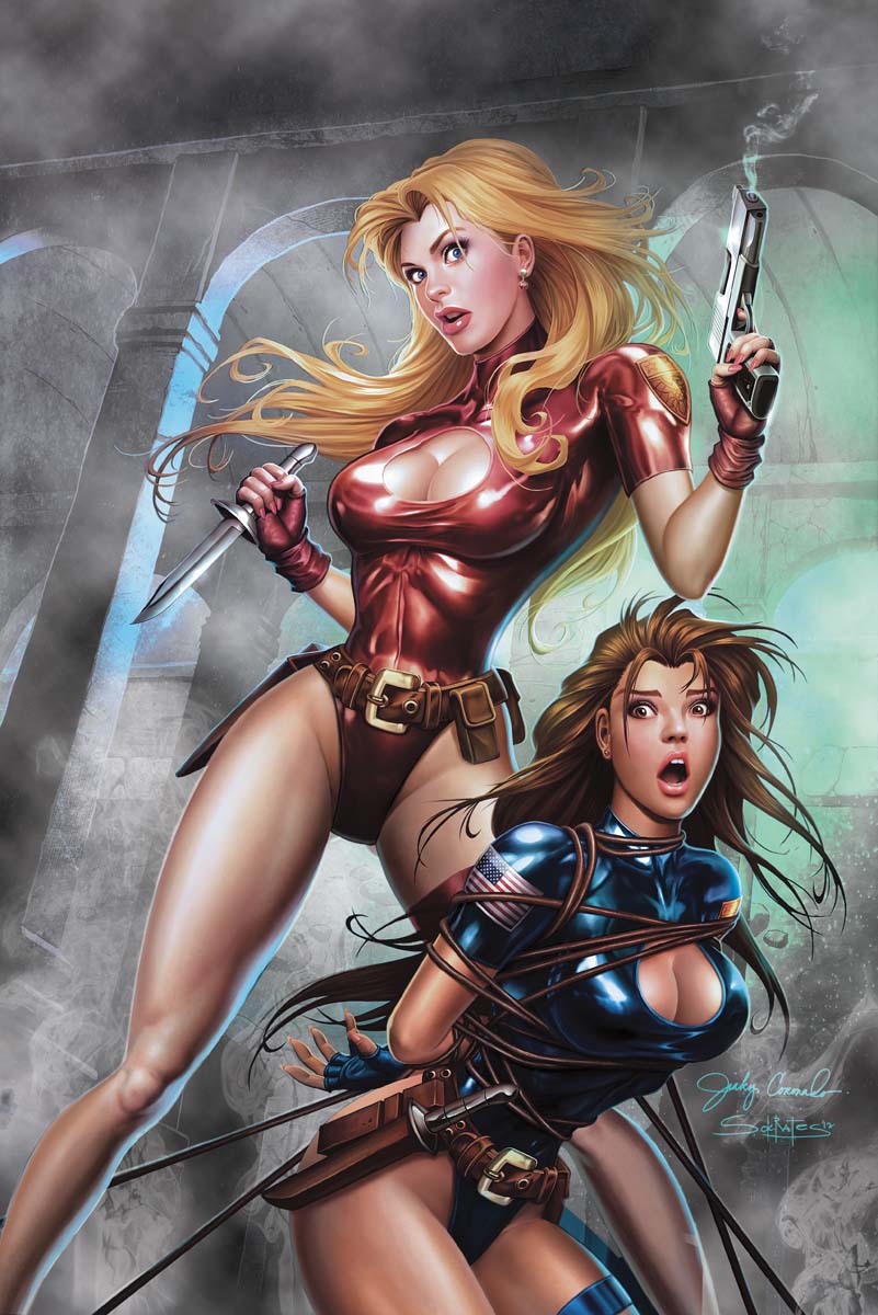



 This is awesome!!!



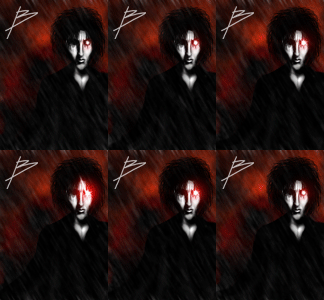
 It's very fascinating to see the artistic process behind this image. It still looks more like a (gorgeously painted) comic cover than a movie poster (most visible with the hair imo, and perhaps inevitable with your slightly cartoonish art style), but the detail and the desaturated colours really make it something special.
