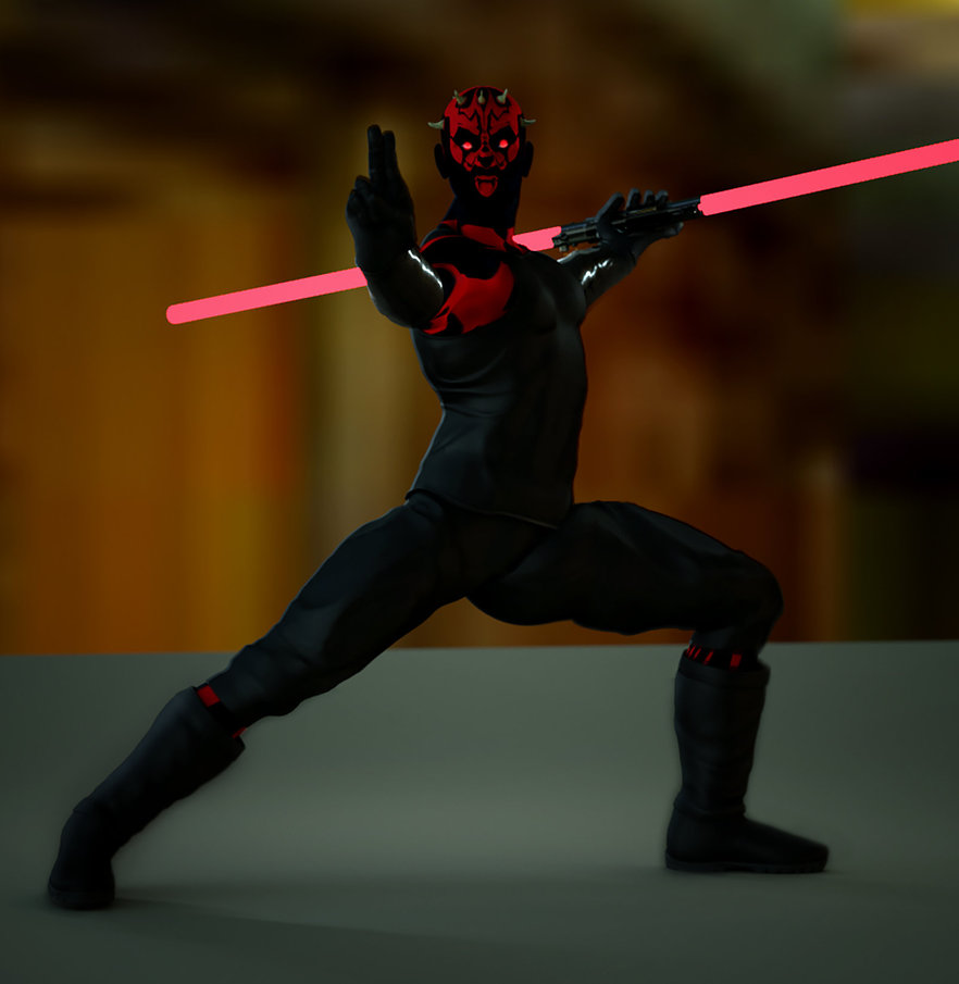
If I may give a constructive crit. on this one. Let me start by saying I like this. It just has a few things that I would have done to make it fantastic.
1. I do not know if you meant for the lightsaber to shadow out his front side, but he is just too dark. There is no definition, and with this, his mouth looks like makeup instead of being open with rage. I would have liked to see more detail on the front of Maul.
2. the lightsaber needs some post work. Right now it looks like one of those dime store plastic toy lightsabers. With a little post work on this, those blades could have really been impressive. As a matter of fact, if I was to have done this image, I would have left the blades off completely and done them in photoshop.
3. with that said, he needs a little red lighting (highlights) on his shoulders and side of face to make it look like that lightsaber is glowing.
4. the hand holding the lightsaber looks funny, and since there is no detail, I can't tell what it is doing.
Other than that, I like the picture as a whole. Cool pose and the background, although abstract, works well with this. Good work.





 ! 3D Art !
 Sci-fi