Moderator   Joined: 2006/7/18 From: United States Posts: 6363 |
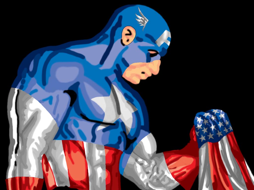
 Re: Captain America I must say, this is a bit of a mixed bag for me because I think you've got some really great things going on (in fact, I was blown away by the thumbnail). Although this is painted in a broader brushstroke, your shadows, midtones and highlights are really very good overall but the black shadows are overkill and would have worked better if toned down to match the surrounding colors. Also I presume your base model was a weightlifter doing a curl, it might work better to leave out his veins (particularly in the gloves). Lastly, Cap's profile appears to me to have rather distinctly European features. I apologize if I'm sounding overly critical here because I really think you're onto something here (great job on the flag, BTW). Good job overall.
|




 ! 2D Art !
 Marvel Comics