| Poster
| Thread
|
| Darkwinter999 |
Posted: 2008/6/1 15:40 Updated: 2008/6/1 15:40 |
superhero   Joined: 2007/3/10 From: the Shadow World Posts: 492 |
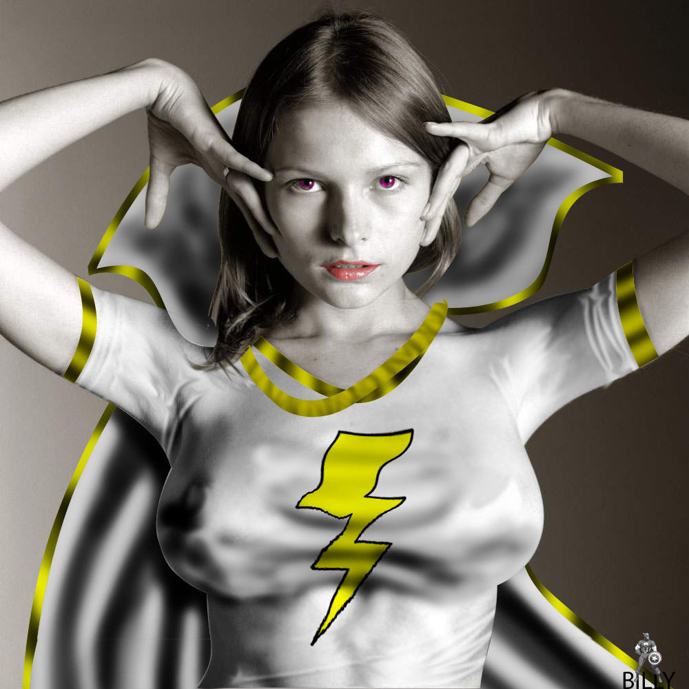
 Re: mary marvel I think the B&W effect of this is cool, and it really makes the few colors pop (Schindler's list did B&W with a couple red things, so I think it's fine) but the thunderbolt looks weird being wrinkled like that, a bit more realistic would look nicer, and the lack of realism in the (esp.) gold rope around her neck looks out of place. Skill aside, the artisitic effect looks awesome!
|
|
|
| Winterhawk |
Posted: 2005/10/8 17:39 Updated: 2005/10/8 17:39 |
Guardian of the Great White North (Webmaster)   Joined: 2003/8/17 From: Canada Posts: 6812 |
 Re: mary marvel You went A little too strong on the Burn tool on this one buddy, still a good job.
|
|
|
| JrMcDeath |
Posted: 2005/9/21 15:19 Updated: 2005/9/21 15:19 |
Kling on HM (WebMaster!)   Joined: 2004/7/19 From: My Box Posts: 6995 |
 Re: mary marvel Maybe she is white because she is a Bizzaro-esque character.
|
|
|
| Thayne |
Posted: 2005/9/21 6:37 Updated: 2005/9/21 6:37 |
Dazed and Confused... mostly Confused   Joined: 2004/7/15 From: usa Posts: 3290 |
 Re: mary marvel Ok I don't think this is rushed or subpar. For me its a matter of pic choice. She's so freakin white I would've made her a vamp chick.
|
|
|
| Guest |
Posted: 2005/9/20 4:38 Updated: 2005/9/20 4:38 |
| |
 Re: mary marvel Billy, I have to agree with DW on this. You have definetly put out much better stuff. Not that this sucks horribly, but when you are used to seeing a Billy piece look so nice and well put together and then see something that looks rushed or sub-par, then you have to wonder why. You are so, so much better than this.
|
|
|
| Dark Wanderer |
Posted: 2005/9/20 2:21 Updated: 2005/9/20 2:21 |
The Metal Shinigami (Moderator)   Joined: 2004/12/6 From: Kentucky Posts: 5149 |
 Re: mary marvel no offence, but this is not one of your better pieces. I do like the concept of this, but under her left arms needs a little cleaned up, as do the ropes around her neck. the shading is a little off in places in the cape. for example where the collar on her left folds, it should have a triangle look to the shading pointing in towards her neck make since? and the edges on the bolt could have been a lot cleaner using the pen tool.
|
|
|
| VampireLover |
Posted: 2005/9/19 21:00 Updated: 2005/9/19 21:00 |
Seductress of Sin (real life Babe)   Joined: 2005/2/20 From: Hottest Depths of Hell Posts: 2223 |
 Re: mary marvel Good job, Billy. Love the shine on the gold strips. She sorta looks like a statue coming alive.
|
|
|
| Dragondack |
Posted: 2005/9/19 19:25 Updated: 2005/9/19 19:25 |
The Great Eternal Dragon   Joined: 2004/2/9 From: Edmonton,Alberta,Canada Posts: 11326 Online! |
 Re: mary marvel  Hey Billster she looks pretty nice but couldn't you have given her just a bit more skin tone? Hey Billster she looks pretty nice but couldn't you have given her just a bit more skin tone? |
|
|
| Guest |
Posted: 2005/9/19 16:53 Updated: 2005/9/19 16:53 |
| |
 Re: mary marvel not bad not to sound like dd.but it does look better in thumpnail maybe if you make it a little smaller .then you can take it in all at once btw.....the bolt looks great  |
|
|





 ! Manip !
 DC Comics