Ultimate Captain America
 Squedge Squedge  2003/12/15 14:01 2003/12/15 14:01
 4397 4397  2 2
(My original post got screwed up... so I'm reposting, cause the pic isn't there anymore... Here's most of the original text of my post...)
I've long had a pipe dream of being able to manip in photo-realism, and (while still not there by a long shot) this is a big step forward, compared to my older stuff.
I rendered the body in poser, with the 'nude muscle man' figure as the base (of course, I tweaked it a little...) The face is that of David Boreanaz, which is a reasonably close match to Brian Hitch's Cap. I've never liked the idea of Brad Pitt as Cap, or nearly all of the other suggestions that have been made. I think Boreanaz is a suitable compromise of looks and talent. After all... this ain't Shakespeare.
I replicated the costume fairly faithfully. I left out the shoulder patches (cause I really don't like them, even if the Govt. *would* put them on the costume) and tried to make the costume materials as realistic as possible, in terms of what might be used as a movie costume. I know that's not realistic looking scale mail... But I don't think they'd use realistic scale mail. I'd bet they'd use neoprene with a shiny finish, so that's what I shot for.
Fabricated/painted all the clothes with the following exceptions: I frankensteined the pouches and boots, and the wrinkles, too. All the other tidbits are mine: the seams, the wrinkles, the textures, the shadows.
For the shirt, I copied the selection to be textured to it's own layer, desaturated it, and locked the transparency.
I used the gaussian blur filter to take away the detail, and the smudge, blur, color burn, and clone tools (variously, and with various opactities, but never more than say... 30% on any one of them) to remove the nipples. This gave me the base for the textured image. I duplicated the layer again, to have a layer to play with, and used the texturizer function (with the load texture function, I used a texture called scales which comes with Photoshop 7, but I reduced the total .pdf size before I used it, to make the "scales" smaller) to do the rough scaling of the shirt.
I used the fade last effect function to back off the scaling a little bit, then opened the Liquify filter and applied the image to a wireframe I had custom made for the image, to vary the consitency and add a bit of dimension to the scales. They tend to be pinched together in the "lower places" (grooves, curves, etc...) and fuller in the broad, flat, or raised areas of the body, like the meat of the pecs and shoulders.
I pulled the opacity of the layer down a little to help take more of the stark edge off the "scales," blending it with the blurred layer beneath it.
I then duplicated the layer again, filled the non-transparent bits with a solid blue, and set the layer to color. I duplicated that layer again and set the layer mode to color burn. Then I played with the opacities of the two color layers until I was happy with the coloration.
The shield he stands on was made from scratch, using concentric, painted circles, then merging them. I used the free transform:perspective tool, and nudged it into an acceptible angle, then used the plastic wrap filter on it, twice, and faded the plastic wrap a bit on the second time (using Poser 7's fade the last effect feature).
Covered it all in a bit of noice (monochromatic, gaussian) and faded it a bit as well.
Whaddya think? |
|
|
The comments are owned by the poster. We aren't responsible for their content.
| Poster
| Thread
|
| Dragondack |
Posted: 2005/2/3 22:57 Updated: 2005/2/3 22:57 |
The Great Eternal Dragon   Joined: 2004/2/9 From: Edmonton,Alberta,Canada Posts: 11325 |
 Re: Ultimate Captain America Kinda a mid era modern Cap!
|
|
|
| Winterhawk |
Posted: 2003/12/15 19:05 Updated: 2003/12/15 19:05 |
Guardian of the Great White North (Webmaster)  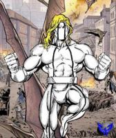 Joined: 2003/8/17 From: Canada Posts: 6812 |
Re: Ultimate Captain America I said it before and i will say it again. I like it. it shows great quality.
One thing that i have thought about looking at this picture again is how non-poser like it looks. most stuff that i have seen here and elsewhere done with poser, always has a "poser" look to it. this picture has a manipulated look to it not a poser look. that in itself is a compliment. If you had not said so, i would have thought that it was photoshop only project. now you did a great job on the costume and the mask. very very well done. But there is something i just dont know what it is, or how to explain it correctly. But i will give it a try. The head to me seems not to be connected to the body. I am not sure why, the colors match the shading is right, but it just seems that the head is not quite right. it might be because the head is looking straight ahead and i would be expecting it to have an upwards angle.I am not to sure.
Don't get me wrong, this is fantastic work. i did not even notice this the first time around. I have looked at it, a little longer this time around.you get 9/10 from me.
Btw: Great artist notes. for a newbie like me, it is like gold.
|
|
|
|


 ! Manip !
 Marvel Comics