hi folks, oh it's been a long time since i've done any pics. sorry i've been away for a while but u have tried to keep up with things here at HM.the quality of work is still pretty high here but i guess that was never going to change.
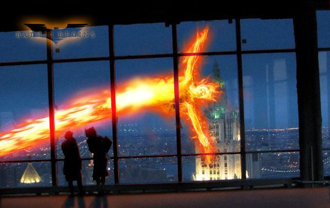
i always feel that a human torch pic helps me get back into the swing of things, so here's one.
The quality with this pic is not the question. It's great. But I think that ( and maybe IM wrong) but besides the fact that the fireguy is a giant, the fire around his head and arms is not how it should be. I mean, if he's flying, shouldn't the wind make the fire blow in the opposite direction from where he's headed? So it kindalooks like he's just hovering sideways infront of the glass(but certainly not moving in a forward direction). But dont get me wrong, The quality is great -- MUCH better than what I can do presently. Just watch the details. They can make or break a masterpiece.
Only one critique... Torch looks like he's significantly bigger than the people watching him through the window, even thos the people are closer to us (if only marginally)... if you still have this thing layered, might try scaling torch down a touch.