Main Menu
Search

Advanced Search
or try google search
HM's Goodies and such
Become a Gold member!

Click Here for more Details about gold Memberships or click the Icon above to donate. Remember to include your Username with donations.
Random Images
PHANTOM LADY
Happy Halloween
the she demon
Unicorn 31 in 30-Day Twenty-Seven - Straight G
Top Posters
1
Dragondack
11277
2
JrMcDeath
6993
3
Winterhawk
6812
4
pijon
6363
5
Dark Wanderer
5149
6
StarChild
3909
7
OCP
3461
8
Thayne
3290
9
BikerBot
3277
10
bhm1954
2852
Who's Online
124 user(s) are online (82 user(s) are browsing Heromorph Gallery)

Members: 0
Guests: 124

more...
advertisements
Your
AD
Here!
» Sign up Today!!
» Newest Forum Posts
» advertisements
Your AD Here!

Main : ! 2D Art ! : Original Characters :  What Was To Be...

[<   Previous  593  594  595  596  597  598  599  Next   >]

What Was To Be...
What Was To Be...Popular
SubmitterMachobubbaMore Photos from Machobubba   Last Update2013/4/1 20:40
Hits1861  Comments5    
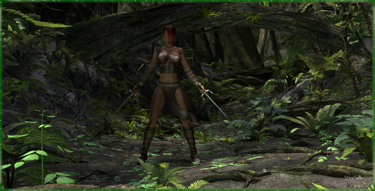
This was my original concept for what turned out as Elektra... THIS IS A FINISHED PROJECT.... Just I wasn't gonna post it after the turn around... But then I thought it's a pretty cool image... Let's give it a shot....

[<   Previous  593  594  595  596  597  598  599  Next   >]

The comments are owned by the poster. We aren't responsible for their content.
Poster Thread
B
Posted: 2013/4/3 16:13  Updated: 2013/4/3 16:13
The New Number 2 (Moderator-Like Guy)
Joined: 2004/5/16
From: Kamloops, BC, Canada
Posts: 1366
 Re: What Was To Be...
Yup, gotta agree with Pij 'n' Star. The Elektra pic's decent, but this is a lot better. Stronger pose and expression, more interesting lighting, way better background... nice stuff.
JrMcDeath
Posted: 2013/4/3 12:51  Updated: 2013/4/3 12:51
Kling on HM (WebMaster!)
Joined: 2004/7/19
From: My Box
Posts: 6993
 Re: What Was To Be...
The only thing it is missing is like the eye of a monster/dino/big bad guy in the background. Something you HAVE to look for. That would have been cool... But I like this a lot, none the less.
StarChild
Posted: 2013/4/2 19:09  Updated: 2013/4/2 19:09
Shaper of Worlds
Joined: 2004/4/5
From: Matteson, Il
Posts: 3909
 Re: What Was To Be...
im with Pijon here. although a bit small for my taste..i like the overall composition of this one better.
Machobubba
Posted: 2013/4/1 21:40  Updated: 2013/4/1 21:40
Herald
Joined: 2009/10/8
From: Residing Philadelpihia, From New Jersey
Posts: 1770
 Re: What Was To Be...
Yeah that's why I decided to post it anyway...
pijon
Posted: 2013/4/1 20:53  Updated: 2013/4/1 20:53
Moderator
Joined: 2006/7/18
From: United States
Posts: 6363
 Re: What Was To Be...
I hate to say it but I like this one better. Don't get me wrong, I liked Elektra too but expression, pose, textures, set, lighting all look better to me here. Really good stuff.


»
»