| Poster
| Thread
|
| Lady Heromorph |
Posted: 2010/3/4 9:07 Updated: 2010/3/4 9:07 |
Official Award   Joined: 2005/10/21 From: Mammoth Mountain Posts: 5502 |
 Re: STAR WARS! by Jinky Coronado (1 of 3) This Image made Lady Heromorph's Top Images of the Week ending February 20th, 2010. Congrats.  |
|
|
| JinkyCoronado |
Posted: 2010/2/22 20:04 Updated: 2010/2/22 20:04 |
Real Life Comic Goddess   Joined: 2009/7/7 From: Orlando, FL & Iloilo, Philippines Posts: 386 |
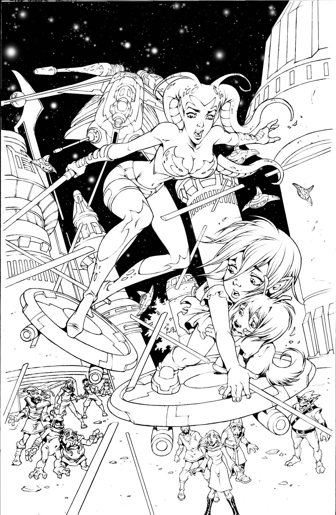
 Re: STAR WARS! by Jinky Coronado (1 of 3) Don't worry, Wyldstaar, I've been drawing sequential comics professionally for a bunch of years. This is the first page of a series of sequential pages....this first page was to get my feet wet, so to speak, doing aliens and spaceships....
Hugs,
-- Jinky
|
|
|
| chowyspizz |
Posted: 2010/2/21 11:26 Updated: 2010/2/21 11:26 |
Ring Forger   Joined: 2007/8/23 From: Mexico Posts: 1252 |
 Re: STAR WARS! by Jinky Coronado (1 of 3) I really want to see this colored
Great job!
|
|
|
| MF |
Posted: 2010/2/19 18:05 Updated: 2010/2/19 18:05 |
Fanboy Extraordinaire   Joined: 2005/3/27 From: MiddleOfNowhere, Ohio Posts: 2385 |
 Re: STAR WARS! by Jinky Coronado (1 of 3) Incredibly cool, Jinky and this is just the black and white version!  |
|
|
| MissVee |
Posted: 2010/2/19 9:27 Updated: 2010/2/19 9:27 |
Arch Nemesis   Joined: 2003/10/20 From: Posts: 1447 |
 Re: STAR WARS! by Jinky Coronado (1 of 3) Very complex composition. I always like to see your inks before colouring. For the rest of us struggling artists here -- it both inspires and intimidates!
|
|
|
| Krasch |
Posted: 2010/2/19 8:55 Updated: 2010/2/19 8:56 |
Gold Member   Joined: 2006/5/14 From: Posts: 259 |
 Re: STAR WARS! by Jinky Coronado (1 of 3) Hey Jinky!
I'll add one comment to the above stuff. Lucas is pretty strict about continuity, so unless you're making a new alien species, I'd remove those two wispy thin head tails and remove the reptiley skin details from the thick ones on your heroine. Assuming she's a Twi'lek, they only have the two thick ones you've given her and definitely aren't scaly at all.
That said, a great boldly dynamic image as always!
|
|
|
| Wyldstaar |
Posted: 2010/2/19 8:04 Updated: 2010/2/19 8:04 |
vigilante   Joined: 2004/1/30 From: Posts: 23 |
 Re: STAR WARS! by Jinky Coronado (1 of 3) From a purely coolness point of view, I think it's great. Lots of action, great characterization, great art.
From the perspective of a showpiece to present to a comic book publisher, this is exactly what you shouldn't do. This is a splash page, which is the easiest form of comic artwork. If you are wanting to show off the goods, you need to display your ability to tell a story in panel form. Making an awesome rescue scene look visually interesting is easy. Making a scene where people are standing around having a conversation visually interesting is hard.
My suggestion would be to find an old Marvel Star Wars comic, and re-draw a sequence. Keep the story, but use a different panel arangement and your own art.
|
|
|



![Jack Staff [Original Artwork: Ian Churchill] Variant Colored Cover to WWOJS #21 Jack Staff [Original Artwork: Ian Churchill] Variant Colored Cover to WWOJS #21](http://heromorph.com/heromorph2/uploads/thumbs4/18829.jpg)

 ! 2D Art !
 Sci-fi