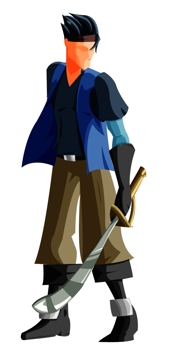
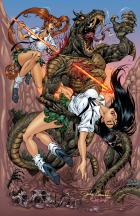
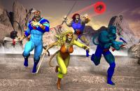
This one came out very well. As I stated earlier, there's a real slickness to these that I like. Still, one of the things I find very engaging about your drawings is the great sense of character. I feels like there is a polar opposition between your two styles... the drawings feel raw with great character and these color images seem slick but that sense of character is lacking. I think that if we were to see this color style with your linework on top, it would be the best of both worlds and quite special indeed.

A couple of minor nits here... where the pants meet the boots, it looks like one boot has a little bit of white space between boot and pants and the other overlaps a bit making them feel a little out of alignment to me. The other thing is the reflections on the sword. The first 3 (closer to the hilt, one white, two grey) feel correct to me, like they are reflecting a landscape or something but as the sword curves, so too does the next two grey reflection bands with it. To me, it creates an illusion of the sword curving along a second axis. I feel you might be better served to have these more closely match those first 3 reflection bands. In spite of these nits, I think this is probably my favorite of this current series done in this style which speaks to the good job you did here.


 ! 2D Art !
 Original Characters