Main Menu
Search

Advanced Search
or try google search
HM's Goodies and such
Become a Gold member!

Click Here for more Details about gold Memberships or click the Icon above to donate. Remember to include your Username with donations.
Random Images
Lois dream
HM Back Issues IV Page 2
The Trenchcoat Mafia by DAGhoul color by BRaZZZil
BLACK CAT
Top Posters
1
Dragondack
11252
2
JrMcDeath
6982
3
Winterhawk
6812
4
pijon
6363
5
Dark Wanderer
5149
6
StarChild
3909
7
OCP
3461
8
Thayne
3290
9
BikerBot
3277
10
bhm1954
2852
Who's Online
75 user(s) are online (20 user(s) are browsing Heromorph Gallery)

Members: 1
Guests: 74

MilfordCan, more...
advertisements
Your
AD
Here!
» Sign up Today!!
» Newest Forum Posts
» advertisements
Your AD Here!

Main : ! Manip ! : Marvel Comics :  x-men 137

[<   Previous  1216  1217  1218  1219  1220  1221  1222  Next   >]

x-men 137
x-men 137Popular
SubmitterBrickMore Photos from Brick   Last Update2004/2/17 22:30
Hits4941  Comments11    
My attempt to duplicate the cover of x-men 137. http://thedarkphoenixsaga.dreamers.com/portadas/uxm137.jpg

It was a frankenstien's monster, and If I _ever_ try something like this again I will take better care in the organization of the project!

[<   Previous  1216  1217  1218  1219  1220  1221  1222  Next   >]

The comments are owned by the poster. We aren't responsible for their content.
Poster Thread
Lady Heromorph
Posted: 2020/2/22 4:25  Updated: 2020/2/22 4:25
Official Award
Joined: 2005/10/21
From: Mammoth Mountain
Posts: 5502
 Re: x-men 137
Congratulations! This classic pic made the Top Images for the Third Week of February, 2020
StarChild
Posted: 2005/5/9 19:49  Updated: 2005/5/9 19:49
Shaper of Worlds
Joined: 2004/4/5
From: Matteson, Il
Posts: 3909
 Re: x-men 137
Jeez Brick This is so good it's scarey. When i first saw the thumbnail I thought it was the original comicbook cover. I actually just clicked on it to see what changes was done to it. Then when I saw this in all it's glory I went speechless.
Totally awesome frankensteining.
BatMic
Posted: 2004/2/20 10:21  Updated: 2004/2/20 10:21
Hellfire Club Member
Joined: 2004/1/29
From: Scotland
Posts: 408
 Re: x-men 137
i must be the only one who hasn't seen the original cover. it would be nice to see a comparison between the two. still, this is a fantastic bit of art i know i wouldn't have the patiance to cut and paste all those different elements together.
most excellent!
Brick
Posted: 2004/2/19 14:10  Updated: 2004/2/19 14:10
Technophobic
Joined: 2003/10/23
From: Pacific North West
Posts: 455
 Re: More info and a really cool link.
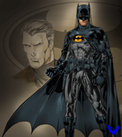
Y'all really pegged me on the walls (and the buckels, I slapped those on in a rush to finnish). When I pulled up the pic. at work it looked like mung.
I have since used the Adobe-gamma tool in the control pannel to set my screen to its optimum setting (check it out those of you who have asked about color calibration). I set mine to "Macintosh default" as opposed to the windows default and its like having a brand new monitor!

Thanks for the links winterhawk (an the head, albeit she was blond. ugh.) That rock tutorial was actually the one I had used, I found it (and the tutorial on exploding text) at www.good-tutorials.com Its a sort of repository for um... good tutorials with a great 'effects' selection.

I had been working on this pic. off and on for awhile, determined to take my time with a project for a change. It was something of a challenge to myself and I was forced to try a lot of new things. Im looking forward to trying the same learning approach on something much simpler.

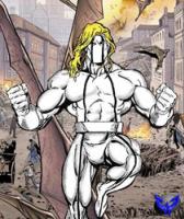
The Idea sprang from wanting to do a pic with action, something more dynamic than hero's standing around.
I was playing around with that shiny costume look when I found something that worked for me. Then I ran across a model whos legs and torso matched Phoenix around the same time I found the tutorial for the exploding text.
So I figured I would try to put them all together.

Cyclops was fabricated much more than Phoenix, his leading leg and shorts are painted in where the rest of him is bits and pieces of male models, the head is sting screaming a tune.
For Phoenix I need only add Winterhawks head (not his real head mind you), an arm and of course a costume.
For the buildings and walls I used the same rock texture and borrowed some of Cereal's filter style to try and differ them and bring the focus back to the center.

Whew. hows that?
Winterhawk
Posted: 2004/2/18 21:46  Updated: 2004/2/18 21:46
Guardian of the Great White North (Webmaster)
Joined: 2003/8/17
From: Canada
Posts: 6812
 Re: my review crew review
Brick, i must say i am really impressed with this piece you have done. It is of very high quality. It turned out very good. This is with out a doubt the best picture you have done so far.
I absolutely love what you did with the exploding logo. great job and great effects.
And you frankenstiened the body parts together perfectly. i was really impressed with both of the figures. very good job.
(Glad the head i sent you worked out for you.)
The energy effects are very nice as well. I really like what you did with both cyclops eye beems and jean's energy blast. very nice.
The planet does need to have a bit of a glow to it. here is a easy tutorial on how to create planets from scratch. it also shows how you can add in a glow to a planet. Click here
I also like what you did with the rock. it was a good. but it could have been better. the pieces of rock needed to have more separation to them. maybe if the lines between them were more pronounced it would have looked more realistic. for a really good way to make realistic stone texture check this out

All in all it is a great job. I like what you did change about the cover design (exploding logo). It added alot to the overall picture.
two thumbs up. i give you 9.5 out of ten. Absolutely excellent.
Dark_Knight_DK
Posted: 2004/2/18 14:17  Updated: 2004/2/18 14:17
Bat Junkie...and who took my meds???
Joined: 2003/8/18
From: Mexico City (we don't wear hats)
Posts: 2619
 Re: x-men 137
Incredible man!! but you need to share your secrets... just a little
greysummer
Posted: 2004/2/18 11:05  Updated: 2004/2/18 11:05
Gold Member
Joined: 2004/1/13
From: Virginia, USA
Posts: 23
 Re: x-men 137
Fan - friggin'- tastic! This is one of my favorite covers of all time and you certainly have done it justice. I would love to see more manips of real comic covers. keep up the kick ass work!
Angelophile
Posted: 2004/2/18 9:40  Updated: 2004/2/18 9:40
mutant
Joined: 2003/11/3
From: England, UK
Posts: 121
 Re: x-men 137
Damn nice try - you've matched the layout pretty much spot on. I'd agree that Earth would have looked better with an atmospheric glow, and I'd have to say there are a couple of weak spots - Cyclops' eye beam looks just a little too crisp around the edges for my liking, the logos on the belts look kinda fuzzy and the background walls look a bit like legos, but it's a brave attempt - you could probably tidy it up and make it even better if you have the patience.

I have to admire you for trying something so ambitious though and you've come close to pulling it off.
Optical_Intruder
Posted: 2004/2/18 6:40  Updated: 2004/2/18 6:40
superhero
Joined: 2003/8/17
From:
Posts: 356
 Re: x-men 137
That's pretty damn incredible. Nice job piecing those poses together, they're perfect. A very ambitious piece, and you pulled it off well. How long did it take you?
My only critical comment, and it's a minor one: the earth should have a slight glow around it (aka the atmosphere).
warmachinex
Posted: 2004/2/18 2:54  Updated: 2004/2/18 2:54
sidekick
Joined: 2004/2/8
From:
Posts: 95
 Re: x-men 137
Fantastic job man, it looks amazing
CEREAL_KILLER
Posted: 2004/2/18 0:07  Updated: 2004/2/18 0:07
mutant
Joined: 2003/11/10
From: NYC
Posts: 186
 Re: HOW DARE YOU SIR, HOW DARE YOU!
As of this moment there is one big thing that sucks about these piece... That fact that you made no attempt to explain how you achieved this amazing feat. For that you suck!

SHAME ON YOU FOR NOT SHARING YOU SKILLS WITH THE OTHERS; SHAME!

One quick question though; why did you choose not to reproduce the cover fully (i.e. The X-Men logo is different then the original)?


»
»