Main Menu |
Search |
HM's Goodies and such |
Become a Gold member! |
Click Here for more Details about gold Memberships or click the Icon above to donate. Remember to include your Username with donations. |
Random Images |
||||
|


Top Posters |
||||||||||||||||||||||||||||||
|
Who's Online |
advertisements |

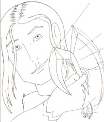
 ! 2D Art !
 Original Characters


 This one's a real nowaday one!