Mr. The Mighty Lord *Krackaboom!*   Joined: 2004/1/13 From: The Good Earth Posts: 3277 |
 Re: Challenge Of The Artists: Absorbing Man vs. Hulk Here are Squedge's Art Notes.
BB
----------------------------------
Art Notes:
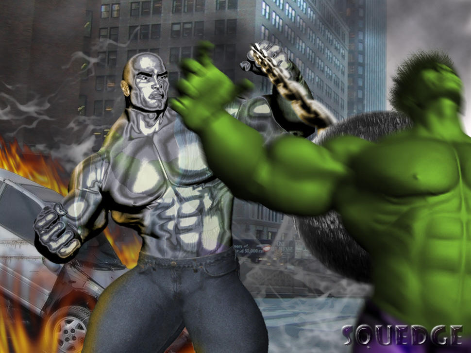
I began, after the concept, with the main figures. I couldn?t find high enough quality images of bodybuilders in suitable poses, so I began to go the ?Poser? route. The morph I wanted (needed) to use for the main chars, though (DAZ?s ?The Freak?) wasn?t available to me. SO I used their sample images. I frankensteined a couple of the images together (from the Freak?s main poses, and from some accessory shots from his Freak Jeans collection) and repositioned the legs on the jeans, using cropped sections of the jeans to fill in wherever necessary, giving the appearance of a wider stance. I played with multiple layers, levels settings, curves adjustments, and layer filters to achieve the metallic sheen of the Absorbing Man?s metallicized skin, as well as using bits of the background and the Hulk figure in blurred, distorted, and liquefied states as overlays to achieve the reflections across his body, adding a touch of realism. His face was altered with the ?liquid? filter (Photoshop CS2) to make him appear more angry.The ball is a civil war cannonball, desaturated and resized with a cutout chain that was resized/shaped to add a sense of perspective, then motion blurred in strategic areas (more towards the ?ball? end) to give the sense of motion and impact. There?s also some glow from the fire on the Absorbing Man and his chain, done with a paintbrush using orange sampled fomr the fire itself and then applying it as a screen over the figure.
The Hulk was done similarly, but with much more ease. He was to be blurry, so I was able to skimp a bit on his details in spots. I had to paint the hair by hand, as the base figure was bald, as well as the pants, because he was in a catsuit. I had to remove sunglasses (pretty easy, using the ?stamp? function and a medium opacity, small-brushed ?smudge.?) I removed some seams from the image with smudge and blur tools, and colored him green using the curves and hue/saturation adjustments. I ensured that the motion blur was more prominent in his head and arms than in the center of the torso to give a more dramatic sense of impact, a bit of whiplash.
The backdrop is a NYC street with some cutout cars from a tornado wreckage picture to add a little perspective and a sense of destruction and havoc. A lens blur was added to both the background and to the car at differing levels, to emulate differing levels of focus, caused by distance, for the camera. The fire was added through multiple uses of the ?Fire? filter from Alien Skin, and the white wisps of smoke in the same way. The black smoke came from a rendering of black and gray difference clouds, that I filtered as a multiply layer with a lowered opacity, and used a large eraser brush, also on low opacity, to thin out areas, creating a bit of distance and clarity in the pic.
After finishing, I altered the hue/saturation of the foreground figures (including the car) slightly to help them blend in with the scenery (from a color standpoint) and used the smudge tool set on a low opacity and with a small brush size to ?blend? the edges of Absorbing Man?s skin in with his surroundings a bit, so that it was less obvious that he was cutout and inserted.
This isn?t the most detailed explanation, but it?s the basics.
|



 ! 3D Art !
 Marvel Comics







 Way cool Chrome work,so the Hulk being blurred is that just motion?
